This tutorial introduces concepts, terminology, and a smattering of rtk's features to help give you a sense of what it's like to work with rtk. This is just an overview -- you can browse the API documentation to the left for the real meat.
Although you're of course free to use whatever style you like in your own scripts, you're encouraged to follow rtk's coding style guidelines for the most aesthetically consistent code.
Admittedly, REAPER's own API can't make up its mind about what style conventions to use, so REAPER scripts are always going to look a bit janky, but following rtk's conventions in your own code will at least minimize the jank.
The easiest way to get started is to install rtk via ReaPack. This tutorial assumes you have done that.
You load the library via require(), which, as usual for Lua, searches package.path
for the file. REAPER famously does not setup package.path to anything particularly
useful, so your entrypoint script (the one directly executed by a REAPER action)
will need to initialize package.path.
This example sets package.path to the location where rtk will be installed with the ReaPack:
-- Set package path to find rtk installed via ReaPack
package.path = reaper.GetResourcePath() .. '/Scripts/rtk/1/?.lua'
-- Load the package
local rtk = require('rtk')
-- Set the module-local log variable for more convenient logging.  Throughout
-- this tutorial we will assume both rtk and log variables have been set.
local log = rtk.log
A lot more information can be found on the loading rtk page, but for now you're ready to execute any of the examples in this tutorial and throughout the documentation.
rtk is object-oriented in design, and uses (and in fact embeds) the excellent
middleclass library, where classes can
be created via rtk.class().
Graphical elements such as buttons or text entries are called widgets. The
base class rtk.Widget defines the common API for all widgets. The rtk.Widget
class itself isn't directly useful, but all rtk widgets subclass rtk.Widget.
Widgets have these important qualities:
When a widget is created, you can optionally pass it a table of attributes to initialize. When passing a table, although not required, it is idiomatic to drop the parens around the table:
-- Create a vertical box without any attributes.  Here we use standard parens.
local box = rtk.VBox()

-- Create a button with a specific label and color.  Now here we drop the
-- parens as we're passing a table.  It's optional, and exactly equivalent
-- with the parens, but less visually noisy.
local button = rtk.Button{label='Order More Slurm', color='yellowgreen'}
In this way, we implement a form of keyword arguments with Lua. Lua doesn't support keyword arguments natively, but using the above idiom, it's ergonomically very similar.
Many widgets implement positional arguments within the attributes table, usually only 1 or 2, and only those that are the most common. Buttons, for example, take the label as the first positional argument:
-- This is equivalent to the above example, just using a positional argument
-- for the label.
local button = rtk.Button{'Order More Slurm', color='yellowgreen'}
Attributes are the primary means of controlling widgets. Attributes are set by passing a table to the widget's constructor or via the attr() method, and can be read by simply accessing the field name of the widget:
-- Create a button widget
local b = rtk.Button{'Click me!'}
-- This will show 'visible' is true, which is the default value of this attribute
log.info('button visibility is %s', b.visible)
-- Set the 'visible' attribute to false, which will skip laying out and rendering
-- the button entirely.
b:attr('visible', false)
-- Now this will say false.
log.info('button visibility is now %s', b.visible)
But in fact it's more convenient to use the rtk.Widget:hide() and rtk.Widget:show()
methods. Apart from being more readable, they implement tiny optimizations.
-- Show the button again
b:show()

-- There is also a method to toggle the widget's visibility
b:toggle()

-- But that's really just shorthand for this:
b:attr('visible', not b.visible)
rtk.Widget defines the common set of attributes implemented by all widgets, but
each widget subclass will also define its own set of attributes.
If you're familiar with web development, widget attributes are similar to DOM object properties. In fact, like the DOM, widget attributes also have calculated variants. Calculated attributes are more efficient internal representations of attributes and while you can't set them directly, you can read them via the calc() method.
You can read more about attributes here.
If attributes and methods control the widget's appearance and behavior, responding to user interactions and state changes is where event handlers come in.
Event handlers are special widget methods that begin with "on" and they are
meant to be replaced by your own functions. For example:
local b = rtk.Button{'Reduce sinusoidal depleneration', color='red'}
b.onclick = function(self, event)
    self:attr('disabled', true)
end
Event handlers are invoked as methods, so the first parameter is always going to be the
object instance. In the above example, self and b are the same object.
Like attributes, widgets will typically offer event handlers specific to that widget
type (for example, rtk.Window:ondock() which is only available with rtk.Window),
but you can read about event handlers generally here.
rtk's widget box model is composed of:
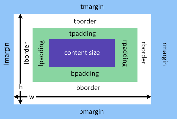
The width and height of the widget includes padding and border. That is, if you define an explicit width for a widget, the amount available for content is your explicit width, minus its border and padding.
On the other hand, if you don't explicitly specify a size for a dimension, then its intrinsic size is used as its content size, which is the size the widget naturally wants to use to fit its required content. For example, a button's intrinsic size is the amount of space needed to draw the label and/or its icon.
This should be familiar if you have web development experience: it is equivalent to CSS's
border-box box sizing, except of course the rtk.Widget attributes are, for example,
lpadding rather than padding-left used in CSS.
And speaking of web development, you don't (usually) build web pages by thinking about the coordinates of every element on the screen, rather you position elements in relation to one another, influencing those relationships through things like padding and margin, and let the layout engine take care of absolute positioning.
This is also how it works with rtk: while you can specify absolute coordinates if you really want, normally you want to add widgets to containers, and let the containers layout each widget according to its box model.
rtk calls the process of laying out widgets reflow. A reflow occurs any time the
geometry of any widget (including the window itself) changes, which could cause the
overall layout of the GUI to change. A reflow computes the layout out of all widgets
provided they are a) ultimately parented up to the rtk.Window and b) you have not hidden
them (i.e. their visible attribute is true).
Containers in rtk are special types of widgets that, as the name implies, encapsulate one or more child widgets. Containers are responsible for laying out their children, sometimes in very specific ways.
rtk has these container widgets:
| Class | Description |
|---|---|
rtk.Container |
Generic container that imposes no special layout on its children, instead relying on children to explicitly define their own positions. This is the base class for (almost) all container widgets. |
rtk.HBox |
Arranges children one after the next horizontally |
rtk.VBox |
Like rtk.HBox, but arranges children vertically |
rtk.FlowBox |
Arranges children in rows, but wraps them onto multiple columns as space permits |
rtk.Viewport |
A single-child container that implements scrolling |
rtk.Window |
The top-level window for the script |
In order to be drawn, all widgets must eventually belong to a container of some sort whose
root ancestor is an rtk.Window. Widgets can be instantiated and modified while
unparented, but they will be inert until added to a container that ultimately parents up
to an rtk.Window.
-- Creates a window, which is a container.  Normally, when undocked, rtk.Window
-- will automatically fit to size its contents.  But here we'll force a fixed
-- size to better demonstrate the alignment attributes.
local w = rtk.Window{w=640, h=480}
-- Creates a button, currently unparented
local b = rtk.Button{'Click me!'}
-- Now add the button to the container, centered.
w:add(b, {halign='center', valign='center'})

-- Or, since the add() method returns the widget back, the last two
-- lines above could be consolidated:
local b = w:add(rtk.Button{'Click me!'}, {halign='center', valign='center'})

-- And just for completeness let's open the window, which makes this
-- a complete script.
w:open()
Once the window is open in the above example, the event loop begins executing and the script will stay alive until the window is closed.
Boxes are probably the most useful container type for creating interfaces. When added
directly to rtk.Window, they can be used to create responsive layouts. Here's an
example that adds an rtk.HBox to a window to create a 3-pane layout:
local window = rtk.Window()
local box = window:add(rtk.HBox())
-- Creates 3 columns in the box, where the third column is twice the width
-- of the other two.
box:add(rtk.Spacer(), {expand=1, fillh=true, bg='cornflowerblue'})
box:add(rtk.Spacer(), {expand=1, fillh=true, bg='royalblue'})
box:add(rtk.Spacer(), {expand=2, fillh=true, bg='tan'})
window:open()
Which generates a window that looks and scales like this:
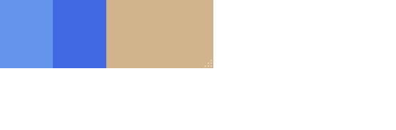
(The rtk.Spacer widgets above are just used as placeholders for demonstration
purposes. In practice you'd use something like an rtk.VBox instead to build
out the layout within each of the panes.)
The second argument to the add() method are called cell
attributes and they influence how the child is laid out within the container. In the
above example, the expand and fillh cell attributes are
specific to rtk.Box (which is the base class of rtk.VBox and rtk.HBox). You can
read more about cell attributes here.
Images are loaded and manipulated using the rtk.Image class. By default, images are
loaded relative to the REAPER entrypoint script (rtk.script_path), but you can also
register search paths using rtk.add_image_search_path().
When you register an image search path, you can indicate whether this path contains either
light or dark icons, in which case we call it an icon path. Icon paths are searched
when icons need to be loaded (for example with rtk.Button.icon or rtk.Entry.icon
attributes).
-- Suppose this path contains black icons.  Non-absolute paths are relative
-- to the entrypoint script path.
rtk.add_image_search_path('../images', 'dark')

-- Now we can create a button and reference an icon from this path.  All
-- icons are required to have png extensions, so this will load the file
-- 18-spanner.png from the above path.
local b = rtk.Button{'Settings', icon='18-spanner'}
Icons can also be recolored to match the current theme or widget color. In the example below, we create a button with a dark luminance but can still load the black icon because rtk will recolor it to white:
-- This is a dark button, so the 'light' icon paths will be searched
-- for 18-spanner.png.  But because (following the earlier example)
-- only dark icons were registered and that's all we could find,
-- rtk will use it and recolor it to white to be suitable for this
-- darker crimson colored button.
local b = rtk.Button{'Settings', icon='18-spanner', color='crimson'}
And of course you can explicitly load and manipulate images:
local img = rtk.Image():load('photo.jpg')
-- Do some sort of manipulation
img:flip_vertical()
img:blur(50)
But rtk.Image instances aren't widgets and can't be added to containers. For this
you need to use rtk.ImageBox, which is a widget that can draw images:
--- Reusing the img from the above example, we can add it to some container
-- via rtk.ImageBox, which can receive the rtk.Image object and draw it
-- as part of the UI.
container:add(rtk.ImageBox{img})
A more sophisticated and robust method for distributing and using images, and especially
icons, is by using rtk.ImagePack. Image packs encapsulate one or more images that
consist of many smaller subimages, also called sprites. This means most or all of the
images/icons used by your application can be consolidated in a single image file for
distribution.
Within an image pack, you can include:
Each subimage in the packed image is assigned a name, which is used when retrieving the
subimage. The retrieved image is an rtk.MultiImage which incorporates all the density
variants for that image name. This enables image adaptive resolution as the UI scales.
In the example below, the file icons.png is defined as having two rows of icons: the
first row has two 18x18 icons representing a pixel density of 1x, and the second row has
two 36x36 icons for 2x density. Both are high luminance icons when light icon styles are
needed.
local pack = rtk.ImagePack()
pack:add{
    -- This is the packed image file that contains the grid of subimages
    src='icons.png',
    -- These are defaults for each strip in the packed image
    style='light',
    names={'edit', 'save'},
    -- And now each following tables defines two horizontal strips
    -- in the packed image.
    {w=18, h=18, density=1},
    {w=36, h=36, density=2},
}
pack:register_as_icons()
The call to rtk.ImagePack.register_as_icons() in the example causes the image names to be registered as icons, and so can be used anywhere within rtk an image string name is accepted. For example:
local button = rtk.Button{'Save Project', icon='save'}
Now that we've covered the fundamentals, let's build a simple (if admittedly contrived) script that provides a button to append a new track, with a settings screen to allow toggling borderless window.
We'll assume you've already loaded rtk as described above. The code below reads in sequence, with periodic breaks for commentary, but if you assembled all the code blocks below into one file, it would execute.
The first thing we do is create a main() function to do the application setup rather
than add lines directly in the global scope. The reason for this is so that we can
invoke it right at the very end using rtk.call(). Doing this provides better error
handling should any of the setup code generate syntax or runtime errors.
And then we'll configure a search path for icon images, and create an rtk.Window():
function main()
    -- Declare the given directory contains light-colored icons (suitable
    -- for dark themes).  Paths are relative to the entrypoint script.
    rtk.add_image_search_path('../img/icons-light', 'light')
    -- We'll create a window, and initialize it as borderless.  The window
    -- isn't open yet, but we can begin adding widgets to it.
    local window = rtk.Window{borderless=true}
Borderless windows depends on the js_ReaScriptAPI extension being available. If it's not,
then not only will the borderless attribute be ignored, but it
will be immediately reverted to false.
In our example, we will use rtk.Application as it provides some conveniences for us:
a basic application frame, with navigation between screens. But first, we'll create
the tables for our two screens:
home: the main application window that is first shown on launchsettings: a settings screen to configure the borderless window settingScreen tables need to have specific fields populated -- see rtk.Application:add_screen()
for more on that.
First our home screen, which merely provides a button to add a new track to the project:
    local home = {
        -- init() is invoked via rtk.Application:add_screen() below.
        init = function(app, screen)
            local box = rtk.VBox{margin=10}
            -- A button to add a new track to the project.
            local button = box:add(rtk.Button{"Add New Track"})
            button.onclick = function()
                reaper.InsertTrackAtIndex(-1, true)
            end
            screen.widget = box
        end,
    }
rtk.Application needs the widget field defined in the screen table, which indicates the
screen's contents. For the home screen it's the rtk.VBox. It's almost always going to
be some sort of container.
Moving along, we'll create our settings screen. This screen's toolbar will have a
"Back" button. We could set the button widget directly to screen.toolbar since
we only have one button, but we'll use an rtk.HBox in case we want to add more
toolbar buttons later.
We use the 18-arrow_back icon here, so this assumes that you have a file in the
registered icon path with this name (that is, ../img/icons-light/18-arrow_back.png).
We could have used an image pack instead -- and would certainly prefer
image packs for more fully featured application supporting multiple display DPIs -- but
for this example, single icon-per-image files is more straightforward. It's up to you to
provide your own icons, but
https://materialdesignicons.com/ is a great place to
start.
    local settings = {
        init=function(app, screen)
            screen.toolbar = rtk.HBox()
            local b = screen.toolbar:add(rtk.Button{'Back', icon='18-arrow_back', flat=true})
            b.onclick = function()
                app:pop_screen()
                -- Marks the click event as being handled. This prevents the event from
                -- propagating to lower-zindex widgets. We particularly want to do this
                -- for toolbar buttons on borderless windows, otherwise if the user
                -- inadvertently double clicks the button and we don't mark this click
                -- as having been handled, then the second click will fall through to the
                -- rtk.Window and register as a double click along the toolbar, maximizing
                -- the window.
                return true
            end

            local box = rtk.VBox{margin=10}
            box:add(rtk.Heading{'Appearance', bmargin=5})
            screen.cb_borderless = box:add(rtk.CheckBox{"Use borderless window when undocked"})
            screen.cb_borderless.onchange = function(cb)
                -- In practice you would have some sort of config state that persists across
                -- reloads, probably using reaper.SetExtState().  This here is purely a
                -- runtime change.
                window:attr('borderless', cb.value)
            end
            -- Because the borderless window feature depends on js_ReaScriptAPI to work, we
            -- simply hide the checkbox if the extension isn't available.
            screen.cb_borderless:attr('visible', rtk.has_js_reascript_api)
            screen.widget = box
        end,

        update=function(app, screen)
            -- Whenever the screen is shown, we update the checkbox value based on the
            -- current borderless state.
            screen.cb_borderless:attr('value', window.borderless)
        end,
    }
Now that we have our screen tables defined, we can instantiate the rtk.Application and
add the screens. By default, the first screen added is the one we start with.
The last thing to do before opening the window is adding a global toolbar button to open the settings screen. A screen can't be opened more than once, so clicking this icon from within the settings screen is a no-op.
    local app = window:add(rtk.Application())
    app:add_screen(home, 'home')
    app:add_screen(settings, 'settings')
    -- We'll also hide the application status bar since we aren't using it.
    app.statusbar:hide()

    local b = app.toolbar:add(rtk.Button{icon='18-settings', flat=true})
    b.onclick = function()
        app:push_screen('settings')
        -- Mark as handled, for the same reason as described above.
        return true
    end
    window:open()
end
Now that we're done our main() function that sets up the UI and opens the window, we can
invoke it using rtk.call(). While you could call main() directly, using rtk.call()
gives much improved error handling by logging stack traces to the console if there are
errors.
rtk.call(main)
And with that we have a working application. Even if it is a bit useless. :)
Out of the box, rtk has a dark theme and a light theme. The default behavior is to
examine the current REAPER theme's window background color (or rather its luminance) and
automatically choose either dark or light rtk themes, setting the background color
based to the REAPER theme's color.
You can override the default behavior by explicitly calling rtk.set_theme() or, perhaps
more conveniently, rtk.set_theme_by_bgcolor() which will automatically choose either the
light or dark rtk theme and set the background to your own chosen color.
-- Flying in the danger zone?
rtk.set_theme_by_bgcolor('red')

-- As with everywhere else rtk takes a color, HTML-style hex codes
-- are also supported.
rtk.set_theme_by_bgcolor('#1c4d9f')

-- Or you can override the automatic theme choice based on background
-- luminance and do something a little less typical.  Here we use
-- the dark theme, but force the background color to a light grey.
-- You probably don't *want* to do this -- you'll get barely readable
-- white text on a slightly-less-white background -- but you get the idea.
rtk.set_theme('dark', {bg='lightgrey'})
Various other aspects of rtk's widget visuals can be controlled by overriding theme defaults. For example, suppose we want to change the default button color in the dark theme:
rtk.set_theme_overrides{button='cornflowerblue'}
Or you can create an entirely new theme without overriding any of the default
theme values. This example creates a new theme called lilac that is based
on the dark theme, but overrides several theme settings to purple hues:
rtk.new_theme('lilac', 'dark', {
    bg='#151217',
    text='#e0cec8',
    button='#9440c8',
    heading='#e5b1e6',
    entry_bg='#6451a955',
    entry_border_hover='#684fbe',
    entry_border_focused='#9d89e2',
})
rtk.set_theme('lilac')
rtk provides a relatively capable animation system that can be used to animate many different kinds of widget attributes.
Not all attributes can be animated, but any attribute whose calculated value is either numeric or a table comprised of numeric values can be animated. Because colors are calculated as a red, green, blue and alpha 4-tuple, this means colors can be animated too.
local b = box:add(rtk.Button{'Click me for a surprise'})
b.onclick = function()
    -- Slowly fades the button out to fully transparent over the
    -- course of 2 seconds
    b:animate{'alpha', dst=0, duration=2}
end
rtk.Widget.animate() returns an rtk.Future, which allows you to chain multiple
animations together to create a sequence. In the example below, we replace the
above button's onclick() handler with one that animates consecutively toward
red, green, blue, and finally back to the default button color:
b.onclick = function()
    b:animate{'color', dst='red'}
        :after(function()
            return b:animate{'color', dst='green'}
        end)
        :after(function()
            return b:animate{'color', dst='blue'}
        end)
        :after(function()
            return b:animate{'color', dst=rtk.Attribute.DEFAULT}
        end)
end
Widget geometry (its size or relative position) can also be animated. Widget
width and height attributes support fractional values
(that is, values between 0.0 and 1.0) which calculates the widget dimension as a fraction
of its parent (e.g. w=0.5 means 50% of the parent container's width).
And this is also supported by rtk.Widget:animate(). The example below animates the
width between 75% of the parent and the button's intrinsic size, and
uses a different easing function to generate a bounce effect:
b.onclick = function()
    if b.w == nil then
        -- Width is nil, which means the button's width is based on its
        -- intrinsic size.  Animate to 75% of the parent container width
        -- over 1.2 seconds.
        b:animate{'w', dst=0.75, duration=1.2, easing='out-bounce'}
    else
        -- Width is explicitly set, so animate back toward the intrinsic
        -- size by setting the width attribute back to nil.
        b:animate{'w', dst=nil, duration=1.2, easing='out-bounce'}
    end
end
Sometimes it's not clear why widgets are being positioned the way they are. To help with debugging and reasoning about the layout process, all widgets have a debug attribute that, when set to true, will paint the boundaries showing their content boundary and overall box (which includes padding).
Perhaps more usefully, though, the global rtk.debug flag enables dynamic inspection by
hovering the mouse over the widget. Out of the box, when log.level is log.DEBUG or
less -- as it generally should be during application development -- this can be toggled by
pressing F12 inside the rtk.Window, creating a kind of poor man's version of debug tools
you might find in your web browser.
The popup shows the hovering widget's:
HBox)Now would be a good time to read through the rtk.Widget API documentation. This is
the common interface for all widgets, and understanding what attributes, methods, and
event handlers are available will give you a pretty good sense of both rtk's core
functionality and its overall design.
Next, read through the rtk module, which will expose you to some of the global
settings and functions.
And after that, click through the various classes and modules and read the introduction to get a feel for what's available in case you need it.
Happy hacking!


