rtk.Text
Displays arbitrary text which can be optionally wrapped (either to fit width constraints
imposed by the parent container or within the widget's own defined width),
otherwise it's clipped (unless disabled by setting overflow to true).
local hbox = rtk.HBox{spacing=5}
hbox:add(rtk.Text{'Name:'}, {valign='center'})
hbox:add(rtk.Entry())
Here's an example with a large block of center-aligned text that will wrap and scroll within a viewport:
local data = 'A big long block of text goes here ... pretend this is it.'
-- Comic Sans used ironically
local text = rtk.Text{data, halign='center', wrap=true, margin=10, font='Comic Sans MS'}
-- Constrain height to 100 pixels within which the wrapped text will scroll
box:add(rtk.Viewport{text, h=100})
Used with the wrap attribute, where lowercase versions of these constants without the WRAP_ prefix
can be used for convenience.
| rtk.Text.WRAP_NONE¶ | 'none' |
Don't wrap the text and instead allow the widget to overflow its bounding box. |
| rtk.Text.WRAP_NORMAL¶ | 'normal' |
Wrap the text at normal word-break boundaries (at whitespace or punctuation), and allow long unbreakable words to overflow the bounding box. |
| rtk.Text.WRAP_BREAK_WORD¶ | 'break-word' |
Wrap text as with |
| text | string | read/write |
The string of text to be displayed |
| color | colortype | read/write |
The color of the text, which is adaptive if nil, using the text color defined in the dark theme if the underlying background has a low luminance, or the text color from the light theme if the background has a high luminance (default nil) |
| wrap | wrapconst | read/write |
Controls the wrapping behavior of text lines that exceed the bounding box imposed
by our container or the widget's explicitly defined width (if set) (default |
| textalign | alignmentconst | read/write |
How individual lines of text should be aligned within the widget's inner content area
(defaults to match |
| overflow | boolean | read/write |
Whether the text is allowed to overflow its bounding box, otherwise it will be clipped (default false, which will clip overflowed text) |
| spacing | number | read/write |
The amount of space between separate lines, where 0 does not add any additional space (i.e. it uses the font's natural line height) (default 0) |
| font | string or nil | read/write |
The name of the font face (e.g. |
| fontsize | number or nil | read/write |
The pixel size of the text font (e.g. 18), which uses the global text font size by default |
| fontscale | number | read/write |
Scales |
| fontflags | number or nil | read/write |
A bitmap of font flags to alter the text appearance (default nil) |
| rtk.Text() | Create a new text widget with the given attributes |
The string of text to be displayed.
This attribute may be passed as the first positional argument during initialization. (In
other words, rtk.Text{'Foo'} is equivalent to rtk.Text{text='Foo'}.)
Strings containing explicit newlines are rendered across multiple lines as you'd expect.
The color of the text, which is adaptive if nil, using the text color defined in the dark theme if the underlying background has a low luminance, or the text color from the light theme if the background has a high luminance (default nil).
Controls the wrapping behavior of text lines that exceed the bounding box imposed
by our container or the widget's explicitly defined width (if set) (default WRAP_NONE).
How individual lines of text should be aligned within the widget's inner content area
(defaults to match halign). Any of the horizontal alignment constants are supported.
This is subtly different from halign. The internal laid out text has its own natural
size based on the line contents, and halign controls the positioning of this inner
content box within the overall rtk.Text widget's box. In contrast, textalign controls
the alignment of each individual line within the inner content box.
When textalign is not specified (i.e. is nil), then it uses the same value as for
halign as a sane default behavior.
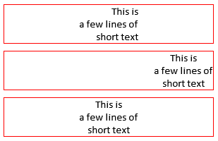
To demonstrate, consider:
local text = 'This is\na few lines of\nshort text'
-- Lines of text are right-aligned relative to itself, but centered within the
-- overall rtk.Text box.
vbox:add(rtk.Text{text, w=300, border='red', wrap=true, halign='center', textalign='right'})
-- Lines of text are center-aligned relative to itself, but right-aligned within
-- the overall rtk.Text box.
vbox:add(rtk.Text{text, w=300, border='red', wrap=true, halign='right', textalign='center'})
-- When textalign isn't specified, it uses the same value as halign, which
-- simplifies the most common use case.
vbox:add(rtk.Text{text, w=300, border='red', wrap=true, halign='center'})
Which results in the following:
Whether the text is allowed to overflow its bounding box, otherwise it will be clipped (default false, which will clip overflowed text).
The amount of space between separate lines, where 0 does not add any additional space (i.e. it uses the font's natural line height) (default 0).
The name of the font face (e.g. 'Calibri'), which uses the global text
font by default.
The pixel size of the text font (e.g. 18), which uses the global text font size by default.
Scales fontsize by the given multiplier (default 1.0). This is a convenient way to adjust
the relative font size without specifying the exact size.
A bitmap of font flags to alter the text appearance (default nil). Nil (or 0) does not style the font.
Create a new text widget with the given attributes.


