rtk.Container
In rtk, containers are special widgets that can hold one or more other
widgets (called children) and manage their position and dimension according to the
semantics of the specific container type. Containers can be nested to create complex
layouts. And because containers are themselves widgets, the attributes, methods, and
event handlers defined by rtk.Widget are all applicable here as well.
rtk.Container is the simplest type of container, and serves as the base class to all
other container widgets, and so other containers also offer at least this interface.
It is a generic, unopinionated container that expects children to specify their
geometry (relative to the parent container position).
Children of containers are placed into cells. A cell is that portion of the container that has been allocated to one child widget. In an rtk.Container, cells given to child widgets are independent and don't affect one another. Subclasses can and do change this aspect. For example, box containers layout children adjacent to each other, so prior siblings will affect the position of later siblings.
Containers ask their children to constrain their dimensions so that all
children can fit within the container (whether the container has an explicit
size, or its own bounding box specified by its parent), but sometimes children
can ignore these constraints, for example if you have specified an explicit
size of a child widget that's larger than the container can hold without
itself overflowing. Containers don't clip their children, rather it's up to the
child widgets to clip themselves if necessary (e.g. rtk.Text.overflow).
As with all widgets, container geometry (coordinates and dimensions) can be static values, or specified relative to the parent (e.g. 80% of parent width).
When no explicit width or height is set, a container's intrinsic size is dictated by the children contained within it.
-- Create a new container that's 50% the width of its parent.
local c = rtk.Container{w=0.5}
-- This centers the label within the button but doesn't affect its
-- position within the container because it's an attribute on the
-- widget itself, not a cell attribute.
local b = rtk.Button{label='Hello world', halign='center'}
-- Ask the button to fill its container.
c:add(b, {fillw=true})
-- rtk.Windows are themselves rtk.Containers.  This adds the container
-- to the window, and because the container has w=0.5, it will end up
-- having a width that's 50% of the window's widget (its parent).
-- Meanwhile, these alignment cell attributes center the container
-- within the window both horizontally and vertically.
window:add(c, {halign='center', valign='center'})
The diagram below depicts how the widget box model works in the context of containers, using a 200px fixed height container. The blue area represents the cell, while the purple box is the widget itself.
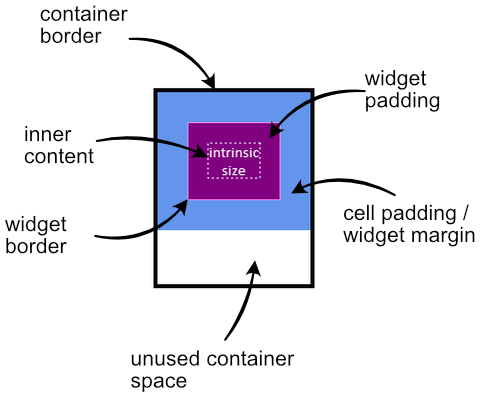
The following code generated the above image (minus the dotted border around the text which was added later as a visual aid to denote the boundary of the inner content):
local c = window:add(rtk.Container{h=200, border='4px black'})
local text = rtk.Text{'intrinsic\nsize', halign='center', padding=20, bg='purple', border='violet'}
c:add(text, {bg='cornflowerblue', padding=30})
With rtk.Container, cells are all overlaid one atop the other, with either
widget margin or cell padding affecting the position of
each cell.
Unless the container is given an explicit size, alignment is done relative to the current size of the container based on all previous siblings. For example:
local c1 = rtk.Container()
-- Makes a big orange box
c1:add(rtk.Spacer{w=0.5, h=0.5, bg='orange'})
-- Because the rtk.Spacer widget was first, this button will be
-- aligned relative to the previous widget, which dictates the
-- current intrinsic size of the container when the button is
-- reflowed.
c1:add(rtk.Button{'Hello'}, {valign='center', halign='center'})

-- Meanwhile, let's reverse the order.
local c2 = rtk.Container()
-- Add the button first, but use a higher z-index so it's drawn above
-- the rtk.Spacer.  But here the center alignment is relative to the
-- current container size, which is empty.  So it ends up being top/left
-- of the container.
c2:add(rtk.Button{'Hello', z=1}, {valign='center', halign='center'})
-- Now the spacer stretches out the container further, but doesn't affect
-- the alignment of the button, which was already decided.
c2:add(rtk.Spacer{w=0.5, h=0.5, bg='orange'})
When adding a child to a container (e.g. via add()), you can optionally set
additional attributes that control how the container will layout that specific child
widget within its cell.
These are the base layout attributes for all containers, but specific container implementations usually include additional ones, or may extend the possible values for these cell attributes, or change the semantics.
| fillw¶ | boolean | If true, the child widget is asked to fill its width to the right edge of the container (unless the child itself has an explicitly defined width in which case this cell attribute is ignored). |
| fillh¶ | boolean | Like |
| halign¶ | alignmentconst | One of the alignment constants (or a corresponding string, e.g.
Note Cell alignment is distinct from widget alignment because it controls how the container positions the widget within its cell, but doesn't affect the visual appearance of the widget itself, while the alignment attributes defined on child widgets controls how the child displays its contents within its own box. When halign is specified as an attribute on the container widget overall, it affects the default horizontal alignment of all cells. Cells can override this default by explicitly specifying the halign cell attribute. |
| valign¶ | alignmentconst | Like |
| padding¶ | number, table or string | The amount of padding around the child widget within the cell. This is equivalent
to widget margin and if both are defined then they add together.
Value formats are also the same as |
| tpadding¶ | number | Top cell padding in pixels; if specified, overrides |
| rpadding¶ | number | Right padding in pixels; if specified, overrides |
| bpadding¶ | number | Bottom padding in pixels; if specified, overrides |
| lpadding¶ | number | Left padding in pixels; if specified, overrides |
| minw¶ | number or nil | The minimum cell width allowed for the child widget. This doesn't necessarily mean
the widget will be this width, rather just that the container will allow the widget
at least this amount of space. To ensure the widget itself is at least this width,
also specify Relative values are supported, so for example a value of This is distinct from the minw widget attribute in that the
|
| minh¶ | number or nil | Like |
| maxw¶ | number or nil | The maximum cell width allowed for the child widget. Unless the widget explicitly defines a larger width for itself, it is expected to shrink or clip as needed to fit within this value. As with |
| maxh¶ | number or nil | Like |
| bg¶ | colortype or nil | Background of the cell or nil for transparent. This is different from |
| z¶ | number | The z-index or "stack level" of the child widget, which is exactly equivalent to
The z-index doesn't affect the order widgets are reflowed, only drawn. |
| children | table | read-only |
An array of child widgets, where each element in the array is {widget, cell attributes table} |
| rtk.Container() | Create a new container, initializing with the given attributes |
| add() | Adds a widget to the container |
| update() | Updates the cell attributes of a previously added widget |
| insert() | Adds a widget to the container at a specific position |
| replace() | Replaces the widget at the given position |
| remove_index() | Removes a widget by position |
| remove() | Removes a widget from the container |
| remove_all() | Empties the container |
| reorder() | Moves an existing child widget to a new index, shifting surrounding widgets |
| reorder_before() | Moves an existing child widget ahead of another child |
| reorder_after() | Moves an existing child widget after another child |
| get_child() | Returns the widget at the given index |
| get_child_index() | Returns the position of the given widget |
An array of child widgets, where each element in the array is {widget, cell attributes table}
Create a new container, initializing with the given attributes.
Any positional arguments passed will be automatically added as children
of the container via add(). In this case, cell attributes can optionally be
specified via a cell field on the child widget.
local c = rtk.Container{
    bg='red',
    padding=10,
    w=200,
    rtk.Text{'Some Random Text'},
    rtk.Button{'I Do Nothing', cell={halign='center'}},
}
Which is equivalent to:
local c = rtk.Container{bg='red', padding=10, w=200}
c:add(rtk.Text{'Some Random Text'})
c:add(rtk.Button{'I Do Nothing'}, {halign='center'})
This makes it possible to specify a full widget hierarchy for the entire window (or arbitrary subsections of it) using a single declaration of nested widgets (otherwise known as an S-expression).
Adds a widget to the container.
The cell attributes table is optional, and may be passed either
as the second argument, or as the cell field in the widget instance itself.
-- Given this box ...
local box = rtk.HBox()
-- ... these two lines are equivalent
box:add(rtk.Text{'Hello World'}, {halign='center', valign='center'})
box:add(rtk.Text{'Hello World', cell={halign='center', valign='center'}})
The second form, while slightly more verbose, may be preferred when you want to dictate
the cell behavior at widget instantiation time, rather than during add().
| widget | (rtk.Widget) | the widget to add to the container |
| attrs | (table or nil) | the cell attributes to apply to the given widget |
Updates the cell attributes of a previously added widget.
| widget | (rtk.Widget) | the widget whose cell attributes are to be updated |
| attrs | (table or nil) | the new cell attributes |
| merge | (bool or nil) | if false (default), the cell attributes will be completely replaced with the given attrs, otherwise they will be merged such that previous cell attributes will be preserved unless overridden in attrs. |
Adds a widget to the container at a specific position.
For rtk.Container containers, it isn't really necessary to insert
widgets at specific positions as the z-index more easily
controls display order. But for subclasses such as boxes where
widget order is visually relevant and independent of z-index, this method can
be used to control the layout of widgets relative to one another.
| pos | (number) | the position of the widget, where 1 inserts at the front of the list. |
| widget | (rtk.Widget) | the widget to insert |
| attrs | (table or nil) | the cell attributes to apply to the given widget |
Replaces the widget at the given position.
The existing widget at the given index is unparented from the container and the new widget is added in its place.
| index | (number) | the position of the widget, where 1 is the first widget. |
| widget | (rtk.Widget) | the widget to add to the container that ejects the existing widget at |
| attrs | (table or nil) | the cell attributes to apply to the given widget |
| (rtk.Widget) | the old widget that was removed and replaced by the given one, or nil if the index was out of bounds |
Removes a widget by position.
| index | (number) | the widget position to remove, where 1 is the first widget. |
| (rtk.Widget) | the child that was deleted, or nil if index was out of bounds |
Removes a widget from the container.
| widget | (rtk.Widget) | the widget to remove |
Empties the container.
Moves an existing child widget to a new index, shifting surrounding widgets.
| widget | (rtk.Widget) | the widget to be repositioned. |
| targetidx | (number) | the new position for the widget, where 1 is the first cell in the container, 2 is the second cell, and so on. Out-of-bounds indexes are clamped. If the target index is the same as the widget's current index then no action is taken. |
| (boolean) | true if the widget if the widget changed positions, or false if the widget was already at targetidx or if the given widget is not in this container |
Moves an existing child widget ahead of another child.
| widget | (rtk.Widget) | the widget to move in front of the target |
| target | (rtk.Widget) | the other child |
| (boolean) | whether the widget changed positions |
Moves an existing child widget after another child.
| widget | (rtk.Widget) | the widget to move after the target |
| target | (rtk.Widget) | the other child |
| (boolean) | whether the widget changed positions |
Returns the widget at the given index.
| idx | (number) | the widget position, where 1 is the first widget. |
| (rtk.Widget or nil) | the widget at the given index, or nil if the index is out of range. |
Returns the position of the given widget.
| widget | (rtk.Widget) | the widget whose position to fetch |
| (number or nil) | the index of the given child widget where 1 is the first position, or nil if the child could not be found. |


