rtk.Button
Standard push button, supporting icon and/or label, with or without button surface.
-- Creates a button with an icon from the path registered by
-- rtk.add_image_search_path() with the icon positioned to the right of the label.
local b = rtk.Button{icon='info', label='Hello world', iconpos='right'}
b.onclick = function()
   -- Toggles between a circle and rectangular button when clicked.
   b:attr('circular', not b.circular)
end
container:add(b)
Used with the flat attribute to control whether and how a raised button
surface will be drawn.
| rtk.Button.RAISED¶ | 'raised' |
The button surface is always drawn (alias of |
| rtk.Button.FLAT¶ | 'flat' |
The button surface is not drawn when in its normal state, but is drawn when
the mouse hovers over or clicks the button (alias of |
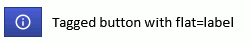
| rtk.Button.LABEL¶ | 'label' |
Applies only when |
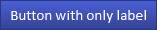
| label | string or nil | read/write |
Optional text label for the button (default nil) |
| icon | rtk.Image, string or nil | read/write |
Optional icon for the button (default nil) |
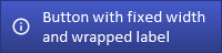
| wrap | boolean | read/write |
If true, wraps the label (if defined) to fit within the button's bounding box (default false) |
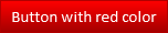
| color | colortype or nil | read/write |
Button surface color, which defaults to the theme's |
| textcolor | colortype or nil | read/write |
Text color when label is drawn over button surface, where a nil value is adaptive
based on |
| textcolor2 | colortype or nil | read/write |
Text color for |
| iconpos | alignmentconst | read/write |
Whether the icon should be positioned to the left or right of the |
| tagged | boolean | read/write |
If true, draws the button with a "tagged" icon which is always anchored to the
right or left of the button (depending on |
| flat | flatconst, boolean or string | read/write |
If true, no raised button surface will be drawn underneath the icon and label unless the mouse is hovering over the button or clicking (default false) |
| tagalpha | number | read/write |
For |
| surface | boolean | read/write |
Whether button surfaces should ever be rendered at all, even when the mouse hovers over or clicks (default true) |
| spacing | number | read/write |
For untagged buttons ( |
| gradient | number | read/write |
Multiplier for gradient on button surfaces (default 1) |
| circular | boolean | read/write |
If true, this is an icon-only circular button (labels are not supported) (default false) |
| elevation | number | read/write |
The elevation of the drop shadow for |
| hover | boolean | read/write |
If true, always draws the button as if the mouse were hovering over it (default false) |
| font | string or nil | read/write |
The name of the font face (e.g. |
| fontsize | number or nil | read/write |
The pixel size of the button font (e.g. 18), which uses the global button font size by default |
| fontscale | number | read/write |
Scales |
| fontflags | number or nil | read/write |
A bitmap of font flags to alter the text appearance (default nil) |
| rtk.Button() | Create a new button with the given attributes |
Optional text label for the button (default nil). Can be combined with icon.
This attribute may be passed as the first positional argument during initialization.
(In other words, rtk.Button{'Foo'} is equivalent to rtk.Button{label='Foo'}.)
Optional icon for the button (default nil). If a string is provided,
rtk.Image.icon() will be called to fetch the image, otherwise an
rtk.Image object can be used directly.
If true, wraps the label (if defined) to fit within the button's bounding box (default false).
Button surface color, which defaults to the theme's button color.
Text color when label is drawn over button surface, where a nil value is adaptive
based on color luminance (default nil). If nil,
button_label from the current theme will be used if it's
compatible with the luma, otherwise button_label from
either the built-in light or dark themes (depending on what's called for) will
be used.
Text color for flat buttons (when the label is not drawn over top a button surface),
which defaults to current theme text color.
Whether the icon should be positioned to the left or right of the label
(default left). Values are as with rtk.Widget.halign
but only left or right are supported.
If true, draws the button with a "tagged" icon which is always anchored to the
right or left of the button (depending on iconpos) and is drawn with a slightly
darker surface compared to the label (default false). If flat is true, only the
label portion is flat until hovering or clicked.
Tagged buttons will always use the widget padding on both sides of the icon,
depending on whether iconpos has the icon on the left or right of the button. If
on the left, then the icon will use lpadding on either side. If right, the icon
will use rpadding on either side. This ensures the icon is always visually
centered.
For tagged buttons, since the icon is always anchored to the far edge, the halign
attribute only controls the centering of the label within the label's portion of
the button. Meanwhile for untagged buttons, halign will adjust both icon and
label position.
Tagged buttons require that both icon and label are set.

If true, no raised button surface will be drawn underneath the icon and label unless
the mouse is hovering over the button or clicking (default false). If false, a surface
is always rendered. A special value 'label' applies when tagged is true, where
the button will render a flat label unless hovered/clicked.
If you want to keep the surface but just want to get rid of the default gradient,
use the gradient attribute instead and set it to 0. Here, flat means something
else.
For tagged buttons, this is the the opacity of the black overlay that is
drawn above the icon area (default is from the theme).
Whether button surfaces should ever be rendered at all, even when the mouse
hovers over or clicks (default true). False here implies that flat is true.
This is used by some widgets that implement button-like behavior even though
they aren't buttons, such as rtk.CheckBox.
For untagged buttons (tagged is false) this is the distance in pixels between the
icon and the label, while for tagged buttons, it's the distance between the tag
edge and the label edge (default 10).
Multiplier for gradient on button surfaces (default 1). 1 means to use the default gradient from the theme. Larger values increase the contrast of the gradient, while values less than 1 decrease the contrast of the gradient, where 0 is a completely flat color. Negative values risk creating an irreparable rift in the fabric of spacetime, with repercussions analogous to taunting Happy Fun Ball.
You can also adjust this globally by setting button_gradient_mul
in the current theme by calling rtk.set_theme_overrides().
If true, this is an icon-only circular button (labels are not supported) (default false).

The elevation of the drop shadow for circular buttons with values 0-15 where 0 disables
the shadow, 1 draws a sharper, smaller drop shadow and 15 draws a fainter, larger
shadow (default 3).
If true, always draws the button as if the mouse were hovering over it (default false). Useful for programmatically indicating a focus or selection.
The name of the font face (e.g. 'Calibri'), which uses the global button
font by default.
The pixel size of the button font (e.g. 18), which uses the global button font size by default.
Scales fontsize by the given multiplier (default 1.0). This is a convenient way to adjust
the relative font size without specifying the exact size.
A bitmap of font flags to alter the text appearance (default nil). Nil (or 0) does not style the font.
Create a new button with the given attributes.
| (rtk.Button) | the new button widget |


