rtk.Widget
Base class for all widgets. Not intended to be directly used, but rather subclassed to create specific widgets. However all widgets provide at least this interface.
Used with the halign and valign fields to control horizontal and vertical alignment
of a widget's contents within its own box.
Lowercase strings of these constants can be used for convenience (e.g. 'center'
instead of rtk.Widget.CENTER). These strings, noted in the middle columns below, are
automatically converted to the appropriate numeric constants.
| rtk.Widget.LEFT¶ | 'left' |
Align contents to widget's left edge (for |
| rtk.Widget.TOP¶ | 'top' |
Align contents to widget's top edge (for |
| rtk.Widget.CENTER¶ | 'center' |
Center align contents within widget boundary (used for both |
| rtk.Widget.RIGHT¶ | 'right' |
Align contents to widget's right edge (for |
| rtk.Widget.BOTTOM¶ | 'bottom' |
Align contents to widget's bottom edge (for |
Used with the position field to control how containers will position and scroll
widgets in relation to other widgets in the window.
Lowercase strings of these constants can be used, e.g. 'relative' instead of
rtk.Widget.RELATIVE, or 'fixed-flow' instead of rtk.Widget.FIXED_FLOW. These
strings are automatically converted to the appropriate numeric constants.
If you're familiar with the position property in CSS, your intuitions here should mostly apply.
| rtk.Widget.RELATIVE¶ | 'relative' |
Widget is positioned normally by its parent container and respects the widget's Widgets with non-zero x and y coordinates modify their drawing position relative to
their parent but don't affect layout relative to siblings. For example, a widget in an
If you do want to modify the widget's position and also affect sibling layout, use
|
| rtk.Widget.ABSOLUTE¶ | 'absolute' |
Widget is positioned normally by its parent container and respects the widget's
|
| rtk.Widget.FIXED¶ | 'fixed' |
Widget is positioned initially according to absolute positioning, but then is fixed on
the screen even as the parent viewport is scrolled. As with absolute positioning, Note that if a fixed widget is a child of a non-fixed container and that container scrolls out of view, the fixed widget will not be drawn. |
| rtk.Widget.FIXED_FLOW¶ | 'fixed-flow' |
Like |
Used with the scalability field to control how the widget should respond to
changes to the global scale level.
Lowercase strings of these constants can be used (e.g. 'box' instead of
rtk.Widget.BOX). These strings are automatically converted to the appropriate
numeric constants.
| rtk.Widget.BOX¶ | 'box' |
Scales box model properties (padding, margin, etc) as well as the inner contents (e.g. images and font sizes) of the widget, but fixed dimensions are not scaled. |
| rtk.Widget.FULL¶ | 'full' |
Everything from This is the default |
Used with attr() and queue_reflow() to influence reflow behavior.
A reflow is the process of calculating the geometry of one or more widgets within the
window. See reflow() for more explanation.
| rtk.Widget.REFLOW_DEFAULT¶ | Use a sensible default, which is further described by the individual methods using these constants. |
| rtk.Widget.REFLOW_NONE¶ | Do not perform any reflow at all, regardless of whether the default behavior would have performed one. |
| rtk.Widget.REFLOW_PARTIAL¶ | Only do a partial reflow, which means only the specific widget in question will be
reflowed, not the entire window. This is done when the widget's own size won't change,
but it may need to rearrange the contents within it. For example, changing |
| rtk.Widget.REFLOW_FULL¶ | Recalculate the geometry of all |
The appearance and behavior of widgets in rtk is managed mostly through attributes.
Attributes are special fields in widgets that, apart from the attribute values
themselves, carry associated metadata, such as details about what should happen
internally when the attribute is updated, or how it should be animated. (These are
largely internal details but you can read more about how rtk.Attribute works.)
Attributes that are read/write can be set to influence appearance or behavior, while read-only attributes are only a reflection of current state.
The proper way to set an attribute is via the attr() method that is provided by
the base rtk.Widget class.
local button = container:add(rtk.Button{'Nuke it from orbit'})
-- After 0.5 seconds, this changes the button color attribute to red,
-- and modifies the label.
rtk.callafter(1.5, function()
   button:attr('color', 'red')
   button:attr('label', "It's the only way to be sure")
end)
Reading back attributes that you previously set is just a matter of access the attribute field directly on the widget. Following the above example:
-- This will display 'red' from above
log.info('Button color is: %s', button.color)
-- This will display "It's the only way to be sure" (again from above)
log.info('Button label is: %s', button.label)
When you set the value of a read/write attribute, it is ultimately translated into
a low-level calculated value. These calculated values can be fetched via the calc()
method. In the above code example:
-- This returns the 4-element {r,g,b,a} table holding the calculated color
-- used internally during drawing.
local c = button:calc('color')
log.info('Calculated color table: %s', table.tostring(c))
Similarly, if you set halign='center' the stringified value of the alignment
constant is translated to rtk.Widget.CENTER, which would be returned by
widget:calc('halign'). Or, suppose you set w=0.5 to assign a 50% relative
width to the widget (more on that later), then once the widget reflows
widget:calc('w') will return the calculated width in pixels.
In most cases the value you store in the attribute -- what rtk calls the exterior
value -- remains the way you set it, and rtk internally uses the calculated
variants. However, whenever a user interacts with a widget in that affects an
attribute, the new value is synced back to both the calculated value and the
exterior value. For example, rtk.Entry.caret is modified when the user moves
where the caret is positioned. Or rtk.Window.w is updated when the user resizes
the width of the window.
Positioning widgets on the screen in rtk is done by adding widgets to containers. There are different containers that provide varying types of layouts. You generally want to let the container dictate the widget's positioning, but you can define it more explicitly if you need to.
x and y coordinates are relative to the parent container and can be negative.
If you're familiar with HTML, this is equivalent to position: relative in CSS.
These coordinates don't affect the layout of the parent container at all, nor do
they affect the geometry of any siblings in the same container, but rather they
only affect this widget's position relative to where the parent container would
have normally placed it.
Consequently, in boxes, setting x/y coordinates on a widget can cause it
to shift into the cells of siblings (or even outside the container's own box).
Sometimes this is what you want, for example to produce certain effects, but
usually not. However for the base rtk.Containers, since this simple type of
container doesn't impose any positioning on its children, it makes more sense to
specify x/y, although they are usually combined with halign and valign cell
attributes. For example, you might set the widget to x=-20 and then add it to an
rtk.Container with a cell attribute of halign='right' in which case it will
cause the right edge of the widget to be positioned 20 pixels from the right edge
of its parent container.
But even in the above example, it's more idiomatic to use an rpadding=20 cell
attribute in combination with halign='right' and leave the widget's x attribute
at 0.
All that's to say, you almost never need or want to specify x or y. You can,
but there are probably more robust and more readable positioning options by
combining container cell alignment with cell padding.
(Because remember that x and y do not affect the position of siblings in the
same container, whereas cell padding does.) See rtk.Container for more on cell
attributes.
Width and height are unspecified by default, which means they will choose an appropriate size based on the parent-supplied bounding box, and the widget's natural desired size (called the intrinsic size).
If w and h are between 0.0 and 1.0 or negative, they are relative sizes. If
between 0.0 and 1.0, they indicate a fraction of the bounding box imposed by our
parent. For example, w=0.6 means 60% of the parent-specified bounding box. If
they're negative, then they are relative to the far edge of the bounding box, so
e.g. w=-50 means the widget will extend to 50px left of the right edge of the
bounding box.
When using relative sizes in widgets placed within an rtk.Viewport, the size will
be relative to viewport's bounding box even though the widget may technically be
allowed an unconstrained size (if the viewport can scroll in that direction). For
example, if an rtk.VBox called "box" is the immediate child of a viewport, you
could do box:add(rtk.Button{w=0.8}, {halign='center'}) which would create a
button 80% of the viewport's width and center-align it within the viewport's
bounding box. Meanwhile, box:add(rtk.Button{w=800}) would add a button with a
fixed width of 800 pixels, which may require scrolling the viewport horizontally to
see it all.
The geometry attributes mentioned above all have read-only calculated variants as
determined by rtk.Widget:reflow() stored in the calc table, which indicate the
final geometry of the widget relative to its parent container's outer (border)
coordinates. This includes padding per the border-box style box model (see
padding).
So for example if w=nil, after the window is reflowed, calc.w will hold the final
calculated width in pixels, at least until the next reflow. These calculated
values are guaranteed never to be nil when the widget has been realized.
| x | number | read/write |
Left position of widget relative to parent in pixels (default |
| y | number | read/write |
Top position of widget relative to parent in pixels (default |
| w | number or nil | read/write |
Width of widget in pixels, or as a fraction of parent's width (default |
| h | number or nil | read/write |
Like |
| z | number | read/write |
The z-index, or "stack level" that defines what the order the widget will be drawn in relation to its immediate siblings (default 0) |
| minw | number or nil | read/write |
The minimum width in pixels the widget is allowed to have, or nil for no minimum
(default |
| minh | number or nil | read/write |
Like |
| maxw | number or nil | read/write |
The maximum width in pixels the widget is allowed to have, or nil for no maximum (default nil) |
| maxh | number or nil | read/write |
Like |
| halign | alignmentconst | read/write |
Horizontal alignment of contents within the widget's calculated width
(default |
| valign | alignmentconst | read/write |
Vertical alignment of contents within the widget's calculated height
(default |
| scalability | scaleconst | read/write |
A bitmap of scale constants that defines how the widget will behave
with respect to |
| position | positionconst | read/write |
Controls how the widget reacts when the parent viewport is scrolled
(default |
| box | table | read-only |
Bounding box geometry supplied from parent on last |
| offx | number | read-only |
The x coordinate within our drawing target that we should offset our position as requested by our parent container in its last invocation of draw |
| offy | number | read-only |
Like |
| clientx | number | read-only |
The x client coordinate of the widget as of last draw |
| clienty | number | read-only |
Like |
Left position of widget relative to parent in pixels (default 0)
Top position of widget relative to parent in pixels (default 0)
Width of widget in pixels, or as a fraction of parent's width (default nil).
Where:
Because 1.0 means 100% of the parent's width it does mean that you can't
explicitly specify a widget width of 1px. If you think you need to do this, you're
probably doing something wrong. But if for some reason you desperately need a
widget 1px in size, you can use 1.01 as the value. It will get rounded down to 1
pixel during rendering.
This attribute is animatable, where animating toward relative sizes (0.0 - 1.0) or nil (intrinsic size) is supported.
The calculated value (widget:calc('w')) is also adjusted to account for rtk.scale,
provided the scalability attribute is set to FULL (as is the default).
Like w but for widget height (default nil)
The z-index, or "stack level" that defines what the order the widget will be drawn in relation to its immediate siblings (default 0). Widgets with a higher z-index will be drawn after lower z-index widgets (and therefore appear above them), and their events will be handled before lower z-index widgets.
The minimum width in pixels the widget is allowed to have, or nil for no minimum
(default nil). When this is specified, the widget will disregard any bounding
box contraints by its parent, causing the parent container to overflow its own
bounding box if necessary, which may result in needing to scroll if within
an rtk.Viewport.
Like minw but for height (default nil)
The maximum width in pixels the widget is allowed to have, or nil for no maximum
(default nil). This will constrain a widget's width if it is added to a container
with the fillw=true cell attribute, or if the widget has
a relative width (e.g. w=0.5). In either case the widget will not exceed
maxw.
Like maxw but for height (default nil)
Horizontal alignment of contents within the widget's calculated width
(default LEFT). See alignment constants.
Vertical alignment of contents within the widget's calculated height
(default TOP). See alignment constants.
A bitmap of scale constants that defines how the widget will behave
with respect to rtk.scale (default FULL).
See scalability constants.
Controls how the widget reacts when the parent viewport is scrolled
(default RELATIVE). See position constants.
Bounding box geometry supplied from parent on last reflow(). Primarily maintained
so that reflow() can be called without any arguments and still produce a useful
result. The fields of this table correspond exactly to reflow()'s arguments.
The x coordinate within our drawing target that we should offset our position as requested by our parent container in its last invocation of draw.
If the child is parented within a rtk.Viewport, this will not represent
client coordinates. For client coordinates, use clientx instead.
Like offx but for the y coordinate
The x client coordinate of the widget as of last draw. Client coordinates
are always relative to the window (where the window's top-left point is
0,0), regardless of whether the widget is within a viewport.
Client coordinates are used when interacting with the mouse: the widget might be
placed at the very end of a 5000px height container, but if the viewport holding
that container is scrolled down such that the widget is at the very top of the
screen, its clienty coordinate will be 0.
Another use case is when popping up an OS-native context menu (rtk.NativeMenu), where
we want the menu to popup relative to the widget's current position on screen.
Like clientx but for the y coordinate
rtk's box model allows defining margin, border, and padding around the inner content of all widgets. When the widget's dimensions aren't explicitly defined, its intrinsic size will include padding and border, in addition to the widget's internal content.
If you're familiar with web design, rtk's notion of inner content, padding, border,
and margin are the same as CSS's box model, specifically the border-box box sizing
model where padding and border sizes are included in the widget's dimensions.
That is, if either w or h attributes are specified, then it implicitly includes
padding and border (but not margin), and the inner content will shrink accordingly.
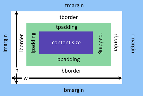
Widget padding affects the amount of space between the widget's border (based on
its own dimensions) and its internal content. For example, an rtk.Button with
a padding of 10px and no explicit dimensions (i.e. it will use its intrinsic size)
will ensure the width and height of the button surface fits its icon and/or label
with a 10px gap to the button's edges.
Meanwhile, margin affects the amount of space around the widget's own box. It is used by parent containers to determine how to place the widget within a container cell. Widget margin is exactly equivalent to cell padding which can be specified when you add the widget to a container. In fact, if both margin and cell padding are defined, they sum together during layout. See here for more on cell attributes.
| padding | number, table or string | read/write |
Shorthand to set padding on all 4 sides of the widget at once (default 0) |
| tpadding | number | read/write |
Top padding in pixels; if specified, overrides |
| rpadding | number | read/write |
Right padding in pixels; if specified, overrides |
| bpadding | number | read/write |
Bottom padding in pixels; if specified, overrides |
| lpadding | number | read/write |
Left padding in pixels; if specified, overrides |
| margin | number, table or string | read/write |
Shorthand to set margin on all 4 sides of the widget at once (default 0) |
| tmargin | number | read/write |
Top margin in pixels; if specified, overrides |
| rmargin | number | read/write |
Right margin in pixels; if specified, overrides |
| bmargin | number | read/write |
Bottom margin in pixels; if specified, overrides |
| lmargin | number | read/write |
Left margin in pixels; if specified, overrides |
| border | table or string | read/write |
Border to be drawn around the widget's box (default nil) |
| tborder | table or string | read/write |
Top border; if specified overrides |
| rborder | table or string | read/write |
Right border; if specified overrides |
| bborder | table or string | read/write |
Bottom border; if specified overrides |
| lborder | table or string | read/write |
Left border; if specified overrides |
Shorthand to set padding on all 4 sides of the widget at once (default 0).
Like CSS, this can be a string in one of these forms:
'5px' - padding of 5 pixels on all sides'10px 5px' - padding of 10 pixels on top and bottom, and 5 pixels on left
and right'10px 5px 15px' - top, horizontal (left/right), and bottom padding'5px 10px 2px 4px' - top, right, bottom, leftAlternatively, a table of 1 to 4 numeric values can be passed as well, with the same element ordering as above for strings.
The "px" unit suffix is optional. Pixels are assumed and no other unit is currently supported. Other units may be supported in the future.
Top padding in pixels; if specified, overrides padding for the top edge (default 0).
Must be numeric.
Right padding in pixels; if specified, overrides padding for the right edge (default 0).
Must be numeric.
Bottom padding in pixels; if specified, overrides padding for the bottom edge (default 0).
Must be numeric.
Left padding in pixels; if specified, overrides padding for the left edge (default 0).
Must be numeric.
Shorthand to set margin on all 4 sides of the widget at once (default 0). The format
is the same as for padding.
Top margin in pixels; if specified, overrides margin for the top edge (default 0).
Must be numeric.
Right margin in pixels; if specified, overrides margin for the right edge (default 0).
Must be numeric.
Bottom margin in pixels; if specified, overrides margin for the bottom edge (default 0).
Must be numeric.
Left margin in pixels; if specified, overrides margin for the left edge (default 0).
Must be numeric.
Border to be drawn around the widget's box (default nil). Borders can be defined
as a CSS-like string that takes border width and/or color (e.g. '1px #ff0000' or
'#ffff00') or a 2-element table holding {color, numeric width}.
Top border; if specified overrides border for the top edge (default nil).
Right border; if specified overrides border for the right edge (default nil).
Bottom border; if specified overrides border for the bottom edge (default nil).
Left border; if specified overrides border for the left edge (default nil).
| visible | boolean | read/write |
Indicates whether the widget should be rendered by its parent (default
|
| disabled | boolean | read/write |
If true and the widget is interactive, it will not respond to user input and
render itself in a way to indicate it's inert (usually with a lower opacity)
(default |
| ghost | boolean | read/write |
A ghost widget is one that takes up space in terms of layout and will
have its geometry calculated in reflow() but is otherwise not drawn
(default |
| tooltip | string | read/write |
A tooltip that pops up when the mouse hovers over the widget and remains still
for |
| cursor | cursorconst or nil | read/write |
The mouse cursor to display when the mouse is within the
widget's region (i.e. |
| alpha | number | read/write |
Alpha channel (opacity) level of this widget from 0.0 to 1.0 (default |
| autofocus | boolean or nil | read/write |
Whether the widget is allowed to automatically receive focus in response to a
mouse button pressed event (default |
| bg | colortype or nil | read/write |
The widget's background color (semantics vary by widget) or nil to have
no background color (default |
| hotzone | number, table or string | read/write |
Shorthand to set the extended "hot zone" on all 4 sides of the widget at once (default 0) |
| thotzone | number | read/write |
Top hot zone extension in pixels; if specified, overrides |
| rhotzone | number | read/write |
Right hot zone extension in pixels; if specified, overrides |
| bhotzone | number | read/write |
Bottom hot zone extension in pixels; if specified, overrides |
| lhotzone | number | read/write |
Left hot zone extension in pixels; if specified, overrides |
| scroll_on_drag | boolean | read/write |
If true, dragging this widget will cause the parent |
| show_scrollbar_on_drag | boolean | read/write |
If true, dragging this widget will cause the parent |
| touch_activate_delay | number | read/write |
The amount of time in seconds a mouse button must be pressed and held over the
widget before |
| realized | boolean | read-only |
True if the widget is ready for |
| drawn | boolean | read-only |
True if the widget was drawn (which also implies both |
| viewport | rtk.Viewport | read-only |
The widget's closest ancestor viewport as of last reflow, which is nil if there is no containing viewport |
| window | rtk.Window | read-only |
The |
| mouseover | boolean | read-only |
Set to true if the mouse is within the widget's region (which is extended according
to |
| hovering | boolean | read-only |
Set to true if the mouse is within the widget's region (extended according to
|
Indicates whether the widget should be rendered by its parent (default
true). If false, this is equivlent to CSS's display:none where it is
not considered as part of layout during reflow(). Parent containers will
not attempt to draw invisible widgets.
If true and the widget is interactive, it will not respond to user input and
render itself in a way to indicate it's inert (usually with a lower opacity)
(default false).
A ghost widget is one that takes up space in terms of layout and will
have its geometry calculated in reflow() but is otherwise not drawn
(default false). This is similar to CSS's visibility:hidden. Also,
unlike visible=false, parent containers will invoke the draw method on
ghost widgets, allowing them to implement a specific visual, but most of
the time drawing ghost widgets simply returns as a no-op.
A tooltip that pops up when the mouse hovers over the widget and remains still
for rtk.tooltip_delay seconds. The tooltip is styled according to
the current theme. Explicit newlines are supported,
and the tooltip will be wrapped if necessary to fit within the window.
The mouse cursor to display when the mouse is within the
widget's region (i.e. mouseover is true). If nil, the default window cursor
is used.
Alpha channel (opacity) level of this widget from 0.0 to 1.0 (default 1.0)
Whether the widget is allowed to automatically receive focus in response to a
mouse button pressed event (default nil). When nil, autofocus will not occur
unless you have attached a custom onclick handler to the widget, in which case
it assume autofocus behavior in order to ensure the onclick handler fires. If
this attribute is explicitly false, then it will never autofocus regardless of
whether there's a custom onclick handler.
The widget's background color (semantics vary by widget) or nil to have
no background color (default nil)
Shorthand to set the extended "hot zone" on all 4 sides of the widget at once (default 0).
The hot zone defines an extended area around the widget's natural boundary where
mouseover events and clicks will be recognized, allowing you to extend the
interactable area of a widget beyond what it visually depicts. This can be useful
when constructing a rtk.Box with spacing between cells, but you want the widgets
occupying those cells to be clickable even within the inter-cell spacing. Another
use case is extending the area that small widgets can be clicked, improving the UX
for touch devices.
The hot zone defines an extension relative to the widget's normal size, so, for example, a value of 5 will extend the clickable area 5 pixels beyond the widget's edge.
The format of this attribute is the same as margin and padding.
The "px" unit suffix is optional. Pixels are assumed and no other unit is currently supported. Other units may be supported in the future.
Top hot zone extension in pixels; if specified, overrides hotzone for the top
edge (default 0). Must be numeric.
Right hot zone extension in pixels; if specified, overrides hotzone for the right
edge (default 0). Must be numeric.
Bottom hot zone extension in pixels; if specified, overrides hotzone for the bottom
edge (default 0). Must be numeric.
Left hot zone extension in pixels; if specified, overrides hotzone for the left
edge (default 0). Must be numeric.
If true, dragging this widget will cause the parent rtk.Viewport (if any)
to scroll when the mouse is click-dragged against the viewport's edge
(default true).
If true, dragging this widget will cause the parent rtk.Viewport (if any)
to display the scrollbar while the child is dragging, even if
the viewport's scrollbar mode would normally have it hidden.
(default true)
The amount of time in seconds a mouse button must be pressed and held over the
widget before onmousedown() is fired, and before ondragstart() is eligible to
be fired, where nil is adaptive based on the current value of rtk.touchscroll
(default nil).
When rtk.touchscroll is false, touch_activate_delay is effectively 0 (i.e.
onmousedown() is invoked immediately when the mouse button is pressed), however
when touch scrolling is enabled the default is rtk.touch_activate_delay, except
for rtk.Viewport where the default is 0ms in order to respond to touch-scrolling.
True if the widget is ready for _draw(), and also ready to handle events (i.e.
it is initialized and reflowed and its geometry is fully known)
True if the widget was drawn (which also implies both realized and visible)
The widget's closest ancestor viewport as of last reflow, which is nil if there is no containing viewport
The rtk.Window the widget belongs to as of the last reflow.
It is safe to assume this is set in rtk.Widget._draw() and event handlers.
Set to true if the mouse is within the widget's region (which is extended according
to hotzone) and not occluded by a higher z-index widget, and false otherwise.
Set to true if the mouse is within the widget's region (extended according to
hotzone) and if onmouseenter() had returned a non-false value. The semantics
of "hovering" is that the widget is interactive and responsive to the mouse
entering the widget's geometry, and so the return value of onmouseenter()
indicates this interactivity.
Normally hovering implies mouseover, but one exception is that if the widget is
being dragged and the mouse is outside the widget's current region, hovering
could be true even while mouseover is false.
| debug | boolean | read/write |
If true, a translucent box will be drawn over the widget visually indicating the widget's geometry and padding, which is useful for debugging layout (default false) |
| id | string | read-only |
An automatically generated identifier for the widget, which is guaranteed to be unique across the life of the program and will not be reused |
| ref | string | read/write-once |
A name for this widget that can be accessed via the |
| refs | table | read-only |
A table through which widget |
If true, a translucent box will be drawn over the widget visually indicating the widget's geometry and padding, which is useful for debugging layout (default false).
An automatically generated identifier for the widget, which is guaranteed to be unique across the life of the program and will not be reused. Widgets will get the same id assigned between program executions as long as the overall scene graph doesn't change.
The value currently happens to be a stringified numeric value, but this may change in the future and should not be assumed by applications. Treat this value as an opaque string.
A name for this widget that can be accessed via the refs table (default nil).
Note that once the ref name is set it cannot be changed.
A table through which widget ref names can be dynamically accessed.
ref names are resolved based on fellow children (or grandchildren) of the
widget's parent container(s). For example, given self.refs.foo, whichever child
(however nested) of the parent container has the ref name foo will be
returned. If there's no match, the parent's parent is consulted, and so on up
the widget hierarchy.
local box = rtk.HBox{
    valign='center', spacing=10,
    -- Use the ref name 'label' for later access
    rtk.Text{w=40, ref='label'},
    rtk.Slider{
        onchange=function(self)
            -- Fetch the label via its ref name in order to update it.
            self.refs.label:attr('text', self.value)
        end
    },
}
window:add(box)
Ref names don't need to be globally unique: the context of which widget's refs
table is being accessed dicates how the name is resolved. If you try to access an
ambiguous ref name -- that is, the nearest parent container which knows about the
ref name actually has multiple child descendents with the same ref name -- you
can't be sure which widget you'll get (and in fact you may not get any at all).
The specific behavior in this case is undefined. So just make sure that when you
access a ref name via a widget's refs table, there is a level at or above the
widget where there is only one such ref name.
Resolving references generally requires both the widget whose refs table is being
accessed and the widget being looked up to be nested somewhere under the same
container. It is possible to resolve an unparented reference as there is a
last-ditch global lookup table that's consulted, but in this case global uniqueness
of the ref name is required.
Because accessing fields on this table involves an upward traversal of the widget's parent hierarchy, there is a cost in accessing distant refs compared to standard Lua table accesses. Consequently, if repeatedly accessing a distant ref, you may want to assign it to a temporary local variable first.
Refs are weak, which means that in order to access a widget by its ref name there
must be some other reference to the widget object in Lua. Any widget added to a
container widget is covered (provided a reference to the container itself exists,
of course). Once the Lua garbage collector frees a widget, it can no longer be
accessed by its ref name.
These methods are intended to be used to control rtk's built-in widgets, in contrast to the subclass API which is used to implement custom widgets.
| attr() | Set an attribute on the widget to the given value |
| calc() | Returns the calculated value of the given attribute |
| move() | Moves the widget to explicit coordinates relative to its parent |
| resize() | Resizes the widget |
| scrolltoview() | Ensures the widget is fully visible within its |
| hide() | Hides the widget, removing it from the layout flow and not drawing it |
| show() | Shows the widget after it was hidden |
| toggle() | Toggles the widget's visibility |
| focused() | Check if the widget currently has focus |
| focus() | Makes the widget focused |
| blur() | Removes focus from the widget |
| animate() | Begin an animation against one of the widget's attributes |
| cancel_animation() | Cancels any ongoing animation for the given attribute |
| get_animation() | Gets the current ongoing animation for the given attribute, if any |
| setcolor() | Sets the graphic context to the given color while respecting the widget's |
| queue_draw() | Requests a full redraw from the widget's |
| queue_reflow() | Requests a reflow by the widget's |
| reflow() | Calculates and returns the widget's geometry given the bounding box |
Set an attribute on the widget to the given value.
This method is the proper way to dynamically modify any of the widget's fields to
ensure they are properly reflected. In most cases the value is immediately calculated
and the calculated form is accessible via the calc() method. (The exception is attributes
that depend on parent geometry, in which case the value will not be calculated until
next reflow.)
Setting a different value will cause the onattr handler to fire, in addition
to any other widget-specific handlers if applicable (for example
onchange if setting the selected attribute on a
rtk.OptionMenu). However if the given value is the same as the current value,
this will be a no-op unless trigger is true, in which case all the event handlers
associated with attr are forced and will fire whether or not the value changed.
Meanwhile, setting trigger to false will suppress event handlers (except for
onattr which always fires if the value has changed), which can be useful if
setting the attribute in another on* handler to prevent circular calls.
| attr | (string) | the attribute name |
| value | (any) | the target value for the attribute. A special value |
| trigger | (bool or nil) | if false, event handlers that would normally fire will be suppressed even if the value changed (except for |
| reflow | (reflowconst or nil) | controls how the widget should be reflowed after the attribute is set. If nil, then |
| (rtk.Widget) | returns self for method chaining |
Returns the calculated value of the given attribute.
Calculated attributes have been parsed and transformed into efficient values that are used for internal operations.
local b = rtk.Button{"Don't Panic", halign='right', padding='10px 30px'}
log.info('halign=%s is calculated as %s', b.halign, b:calc('halign'))
log.info('padding=%s is calculated as %s', b.padding, table.tostring(b:calc('padding')))
b:attr('color', 'indigo')
log.info('color=%s is calculated as %s', b.color, table.tostring(b:calc('color')))
The above example outputs something along these lines:
17:32:30.292 [INFO]  halign=right is calculated as 2
17:32:30.292 [INFO]  padding=10px 30px is calculated as {10,30,10,30}
17:32:30.292 [INFO]  color=indigo is calculated as {0.29411764705882,0.0,0.50980392156863,1}
In the example above, the calculated attributes were all available immediately after
setting, but most attributes related to geometry first require a reflow() before
they're available. Consider:
local text = rtk.Text{"They've gone to plaid!", wrap=true}
-- What should this output?
log.info('calculated width is %s', text:calc('w'))
Here the size of the rtk.Text widget depends on its bounding box, but it hasn't
been added to a container yet, and even if it were, that container may not yet have
been added to its own container yet, and so on, until this rtk.Text widget ultimately
descends from rtk.Window. So widget geometry is not calculated until reflow has
occurred. It is always safe to access in drawing handlers, however.
More on attributes here.
Note that calc can also be accessed as a table. For example, instead of
widget:calc('attr') you can access widget.calc.attr. This means of access is
much faster as it bypasses the abstractions provided when invoking as a method,
but is also more limited: attribute getters are not taken into
account, and the table value is always the current point-in-time value of an
attribute being animated.
Due to the significant performance benefit which can be useful in certain cases, table
access is a supported API, but be aware of its limitations. When in doubt, invoke
calc() as a method.
| attr | (string) | the name of the attribute whose calculated value to return |
| instant | (bool or nil) | if true, the point-in-time calculated value of the attribute is returned even if it's in the middle of an animation. False (or nil) will return the ultimate target value of the attribute if it's animating. |
| (any) | the target value of the attribute if animating, or current value otherwise |
Moves the widget to explicit coordinates relative to its parent.
This is just a shorthand for calling attr() on the x and y attributes.
| x | (number) | the x position relative to parent in pixels |
| y | (number) | the y position relative to parent in pixels |
| (rtk.Widget) | returns self for method chaining |
Resizes the widget.
This is just a shorthand for calling attr() on the w and h attributes,
so fractional values (0.0 to 1.0) and negative values can be used for
relative sizing, as well as nil to have the widget pick its own size.
| w | (number) | the width of the widget |
| h | (number) | the height of the widget |
| (rtk.Widget) | returns self for method chaining |
Ensures the widget is fully visible within its rtk.Viewport.
If the widget is not placed within a viewport then this function is a no-op.
The margin argument ensure the widget is visible plus the supplied margin as a buffer, depending which direction the viewport is being scrolled.
-- Allow scrolling in any directions with 0 margin.
widget:scrolltoview()

-- Allow scrolling in any direction with a 15 pixel margin if scrolling
-- vertically, and a 10 pixel margin if scrolling horizontally.
widget:scrolltoview{15, 10}

-- Only allow vertical scrolling with a 50 pixel top margin if scrolling
-- up, and a 20 pixel bottom margin if scrolling down.
widget:scrolltoview({50, 0, 20}, false)
| margin | (number, table, string or nil) | amount of space to leave on the side of the widget opposite the direction being scrolled, which takes the same format as the |
| allowh | (bool or nil) | if false, horizontal scrolling will be prevented, otherwise any other value allows it |
| allowv | (bool or nil) | if false, vertical scrolling will be prevented, otherwise any other value allows it |
| smooth | (boolean or nil) | true to force smooth scrolling even if the containing viewport's smoothscroll attribute is false; false to force-disable smooth scrolling even if |
| (rtk.Widget) | returns self for method chaining |
Hides the widget, removing it from the layout flow and not drawing it.
This is mainly a shorthand for calling attr() on the visible attribute
but includes a small optimization, which makes it preferred for performance
and readability.
| (rtk.Widget) | returns self for method chaining |
Shows the widget after it was hidden.
This is mainly a shorthand for calling attr() on the visible attribute
but includes a small optimization, which makes it preferred for performance
and readability.
| (rtk.Widget) | returns self for method chaining |
Toggles the widget's visibility.
| (rtk.Widget) | returns self for method chaining |
Check if the widget currently has focus.
This simply just checks is this widget is the same as rtk.focused. In rtk, exactly
one (or zero) widgets can grab focus. A container that holds a focused widget is not
itself considered focused, but depending on the type of event, it may invoke event
handlers for certain events when one of its children has focus.
A widget obtains focus when it is autofocus and the mouse clicks on it (and the
widget is using the default onmousedown() handler), or if focus() is explicitly
called.
| event | (rtk.Event or nil) | if specified, is the event which will be dispatched to event handlers if this functions returns true. This is ignored by rtk.Widget, but subclasses can override. For example, |
| (bool) | true if focused, false otherwise |
Makes the widget focused.
The semantics of a focused widget varies by subclass. For example, with
rtk.Entry it means that the widget will render an accented border, the cursor
will blink, and keyboard events will be captured by the widget.
If another widget currently has focus, blur() will be called on it. If that
widget's onblur() handler returns false, it will block the focus, in which
case this function will return false. This condition is fairly rare but it
can occur, for example, when the currently-focused widget is modal.
If the request to blur the currently-focused widget was successful (or there
wasn't any focused widget to begin with), then our onfocus() handler is
called to determine if focus should be accepted. If that returns anything
other than false, focus is accepted. The default implementation is to accept
the focus.
Note that the autofocus attribute doesn't come into play here. That
attribute controls whether focus occurs on a mouse down, but if focus() is
explicitly called on a widget, the only deciding factor is the return value
from the onfocus() handler.
| event | (rtk.Event or nil) | when |
| (bool) | true if the focus succeeded, false otherwise |
Removes focus from the widget.
Our onblur() handler is first called to determine if focus should be
relinquished. If that returns anything other than false then focus is
surrendered.
| event | (rtk.Event or nil) | when |
| other | (rtk.Widget or nil) | when we are being asked to be blurred because some other widget wants focus, then this parameter is set to that other widget |
| (bool) | true if focus was relinquished and the blur succeeded, false otherwise |
Begin an animation against one of the widget's attributes.
All numeric attributes can be animated, as well as tables containing numeric values. This means that colors can be animated, as colors are calculated as their 4-element rgba values.
All other attributes are animatable only where indicated.
Multiple attributes can be animated in parallel using successive calls to animate().
The argument is a key/value table that describes the animation. Valid fields are as follows, with mandatory fields in bold:
attr field.w or h then the widget's
intrinsic size will be calculated and animated toward. (This also
supports fractional values.)0.5. Frame timing
isn't guaranteed so the animation not complete in exactly this amount,
but the margin of error is typically below 50ms.reflowconst): by default, a full window reflow() will occur if attr
is one that could affect the geometry of the widget, and a partial reflow
will be done for all other attributes. Specifying rtk.Widget.REFLOW_FULL here will
force a full reflow at each step of the animation; conversely, specifying
rtk.Widget.REFLOW_PARTIAL will force a partial reflow even if the attribute is one
that would normally warrant a full reflow.This function returns an rtk.Future so you can attach callbacks to be invoked when
the animation is finished (via done()) or when it's cancelled
(via cancelled()).
You can also cancel a running animation by calling cancel() on
the rtk.Future.
If there is an existing animation for the given attribute, it will be
replaced only if the dst value has changed, in which case the animation
will be restarted from its current mid-animation value toward the new dst
value. If the dst is the same, then the in-flight animation will continue
to run without interruption.
During an animation, the attribute's calculated value is updated to reflect each
individual step of the animation, and this can be fetched by calling calc() with the
instant argument set to true. However, the exterior value -- that is, the direct
fields of the widget object, such as button.color or box.alpha -- are not updated
during the animation. Exterior attributes are updated either at the start of end of the
animation, depending on what makes sense in the context of the attribute.
-- This example causes the button width to animate back and forth between
-- 300px and its intrinsic size with different speeds each time it's clicked.
-- For good measure, we also animate the opacity via the alpha attribute.
button.onclick = function()
   if not button.w then
       -- Use a bouncing effect for the width animation
       button:animate{'w', dst=300, duration=1, easing='out-bounce'}
       button:animate{'alpha', dst=0.5, duration=1}
   else
       button:animate{'w', dst=nil, duration=0.25, easing='out-bounce'}
       button:animate{'alpha', dst=1, duration=0.25}
           :done(function()
               log.info('widget opacity is returned to normal')
           end)
   end
end
| kwargs | (table) | the table describing the animation as above |
| (rtk.Future) | a Future object tracking the state of the asynchronous animation |
Cancels any ongoing animation for the given attribute.
If there are no animations currently running for the attribute, then this function is a no-op.
You can also call cancel() on the rtk.Future returned
by animate() but if you don't have a reference to the rtk.Future you can
call this function.
| attr | (string) | the attribute name to stop animating |
| (table or nil) | nil if no animation was cancelled, otherwise it's the animation state table (see |
Gets the current ongoing animation for the given attribute, if any.
This can also be used to easily test if the attribute is currently animating, as the return value's truthiness behaves like a boolean.
| attr | (string) | the attribute name to check if animating |
| (table or nil) | nil if no animation is running for the attribute, otherwise it's a table containing the current animation state, which includes everything passed to |
Sets the graphic context to the given color while respecting the widget's alpha.
This is considered a low-level function but is useful when implementing custom
widget drawing under/overlays via ondrawpre() and ondraw().
See rtk.color.set() for more information, which this method wraps.
| color | (colortype) | the color value to set |
| amul | (number or nil) | alpha muliplier to apply to |
| (rtk.Widget) | returns self for method chaining |
Requests a full redraw from the widget's rtk.Window on next update.
It's usually not necessary to call this function as widgets know when to redraw themselves, but if you're doing any custom drawing over widgets and need to trigger a redraw based on some event rtk doesn't know about, this can be explicitly called.
| (rtk.Widget) | returns self for method chaining |
Requests a reflow by the widget's rtk.Window on next update.
As with queue_draw(), this method also usually doesn't need to be directly invoked as
it is done automatically when attributes are changed via attr().
If the reflow is expected to change the widget's geometry then mode must be
rtk.Widget.REFLOW_FULL or else sibling and ancestor widgets that may be affected by
this widget's geometry will not properly readjust. However, if no geometry change has
occurred, a partial reflow is preferred as it's much faster.
| mode | (reflowconst or nil) | the type of reflow to occur, where the default is |
| widget | (rtk.Widget or nil) | for partial reflows, this is the widget requesting the reflow ( |
| (rtk.Widget) | returns self for method chaining |
Calculates and returns the widget's geometry given the bounding box.
This is called by parent containers on their children and usually does not need to be directly invoked.
A reflow is required when the widget's geometry could be affected due to a geometry change of a parent (this is called a full reflow because every visible widget must be reflowed at the same time) or when some attribute of a widget changes that, while not affecting its geometry, may affect its internal layout (called a partial reflow because only the affected widgets need to be reflowed). Reflows are not needed when viewports are scrolled.
The bounding box is our maximum allowed geometry as dictated by the parent container.
Our parent itself has its own bounding box (dictated by its parent container, and so
on) and its job is to manage our position, relative to all our siblings, such that we
collectively fit within the parent's box. Parents will clamp any offered boxes based
on minw/maxw and minh/maxh.
If fillw or fillh is specified, it requests that the widget consume the entirety
of the bounding box in that dimension. The semantics of this varies by widget.
For example, buttons will stretch their surface to fit, while labels will
render normally but consider the filled dimension for alignment purposes.
This function will set calc.x, calc.y, calc.w, and calc.h for the widget (i.e.
the calculated geometry) and also returns them.
The box model is akin to CSS's border-box which means that any explicitly provided
width and height (and their calculated counterparts) includes the widget's padding
and border.
If the function is invoked with no parameters, then the parameters used in the
previous invocation will be reused (as cached in rtk.Widget.box). This is
needed to implement partial reflows, in which the widget recalculates its own
internal content positioning within its previously calculated geometry. In
contrast, a full reflow starts at the rtk.Window and recalculates the entire
widget tree.
| boxx | (number) | bounding box of widget relative to parent's left edge |
| boxy | (number) | bounding box of widget relative to parent's top edge |
| boxw | (number) | bounding box width imposed by parent |
| boxh | (number) | bounding box height imposed by parent |
| fillw | (bool) | if true, widget should fill the full bounding box width |
| fillh | (bool) | if true, widget should fill the full bounding box height |
| clampw | (bool) | if true, the widget will clamp to the bounding box width; false implies the widget can overflow the bounding box width, usually because it is parented within an |
| clamph | (bool) | like |
| uiscale | (number) | the current |
| viewport | (rtk.Viewport) | the viewport the widget is rendered into |
| window | (rtk.Window) | the window the widget is ultimately parented within |
| greedyw | (bool) | if false avoid greedily expanding up to boxw even if fillw is true, while if true (as is usually the case), allow expansion. Greediness is disabled when windows are doing an autosize reflow. |
| greedyh | (bool) | like |
| 1. | (number) | calculated x position of widget relative to parent |
| 2. | (number) | calculated y position of widget relative to parent |
| 3. | (number) | calculated width of widget |
| 4. | (number) | calculated height of widget |
| 5. | (bool) | true if the widget expanded to use all of boxw, which information is used by parent containers for more robust positioning. If fillw is true, then it implies true here as well, but there are cases when fillw is false but the widget decides to use all offered space anyway (e.g. for boxes with expand=1). |
| 6. | (bool) | true if the widget expanded to use all of boxh |
These are special methods that are automatically dispatched when certain events occur, such as mouse or keyboard actions. This is the primary mechanism by which user logic is hooked into rtk widgets, allowing the user to modify a widget's default behavior or appearance.
These methods are designed to be replaced wholesale by your own functions. In most cases, returning false from a handler prevents the widget's default behavior.
local b = rtk.Button{label='Click me'}
b.onclick = function(button, event)
    log.info('Button %s was clicked', button)
end
When you assign a custom function to an event handler as in the above example, take note that the first parameter is always the widget itself, even though the handler function signatures documented below don't explicitly include it.
While it is possible to rewrite the above example using implicit receiver passing ...
function b:onclick(event)
   log.info('Button %s was clicked', button)
end
... this is not considered idiomatic for event handlers and should be avoided, in
part because if the handler body is defined within some other method (as is typical),
the handler will mask the outer receiver (as
there can be only one self).
| onattr() | Called when an attribute is set via |
| ondrawpre() | Called before any drawing from within the internal draw method |
| ondraw() | Called after the widget is finished drawing from within the internal draw method |
| onmousedown() | Called when any mouse button is pressed down over the widget |
| onmouseup() | Called when any mouse button is released over the widget |
| onmousewheel() | Called when the mousewheel is moved while the mouse cursor is over the widget |
| onclick() | Called when the mouse button is pressed and subsequently released over a widget quickly enough that it's not considered a long press |
| ondoubleclick() | Called after two successive |
| onlongpress() | Called after the mouse has been consistently held down for |
| onmouseenter() | Called once when the mouse is moved within the widget's region |
| onmouseleave() | Called once when the mouse was previously |
| onmousemove() | Called when the mouse is moved within a |
| onkeypress() | Called when a key is pressed while the widget is |
| onfocus() | Called when a widget is about to be focused where the handler can decide
whether to accept the |
| onblur() | Called when a widget is about to lose focus where the handler can decide whether or not to relinquish focus |
| ondragstart() | Called when a widget is dragged and dictates the widget's draggability |
| ondragend() | Called on a dragging widget when the mouse button is released |
| ondragmousemove() | Called on a dragging widget while the button is being held |
| ondropfocus() | Called when some other dragging widget has moved within our boundary |
| ondropmousemove() | Called when some other dragging widget has moved within our boundary after we
previously accepted being a potential drop target in |
| ondropblur() | Called when some other dragging widget has left our boundary after we previously
accepted being a potential drop target in |
| ondrop() | Called when some other dragging widget has been dragged over us and the mouse button
was released, after having accepted being a potential drop target in |
| onreflow() | Called after a reflow occurs on the widget, for example when the geometry of the widget (or any of its parents) changes, or the widget's visibility is toggled |
| ondropfile() | Called when files are dropped over the widget from outside the application |
Called when an attribute is set via attr(), which is the proper way to modify any
attribute on a widget.
The default implementation ensures that appropriate reflow and redraw behavior is preserved depending on which attribute was updated.
| attr | (string) | the name of the changed attribute |
| value | (any) | the attribute's new calculated value |
| oldval | (any) | the attribute's previous calculated value |
| trigger | (bool) | if true, we are expected to emit any other |
| sync | (bool) | if true, the attribute was set via |
| (bool or nil) | if false, suppresses the default behavior. Any other value will execute default behavior. |
Called before any drawing from within the internal draw method.
There is no default implementation.
User-provided handlers can use this to customize the widget's appearance by drawing underneath the widget's standard rendering. The offx and offy arguments indicate the widget's top left corner that all manual drawing operations must explicitly take into account.
| offx | (number) | the same value per |
| offy | (number) | the same value per |
| alpha | (number) | the same value per |
| event | (rtk.Event) | the same value per |
| (nil) | Return value has no significance. This is a notification event only. |
Called after the widget is finished drawing from within the internal draw method.
There is no default implementation.
User-provided handlers can use this to customize the widget's appearance by drawing over top of the widget's standard rendering.
| offx | (number) | the same value per |
| offy | (number) | the same value per |
| alpha | (number) | the same value per |
| event | (rtk.Event) | the same value per |
| (nil) | Return value has no significance. This is a notification event only. |
Called when any mouse button is pressed down over the widget.
The default implementation focuses the widget if autofocus is true and returns true
if the focus was accepted to indicate the event is considered handled.
| event | (rtk.Event) | a |
| (bool or nil) | returning true indicates the event is to be marked as handled and it will not propagate to lower z-index widgets. Returning false will suppress the default behavior. |
Called when any mouse button is released over the widget.
The default implementation does nothing.
This event will fire even if the mouse button wasn't previously pressed over the same
widget (in other words, onmousedown() was never called). The widget doesn't have to
be focused. The only condition for this event is that the mouse button was
released over top of the widget.
| event | (rtk.Event) | a |
| (bool or nil) | returning true indicates the event is to be marked as handled and it will not propagate to lower z-index widgets. |
Called when the mousewheel is moved while the mouse cursor is over the widget.
The default implementation does nothing.
| event | (rtk.Event) | a |
| (bool or nil) | returning true indicates the event is to be marked as handled and it will not propagate to lower z-index widgets, including (and especially) parent viewports. |
Called when the mouse button is pressed and subsequently released over a widget quickly enough that it's not considered a long press.
The default implementation does nothing.
| event | (rtk.Event) | an |
| (bool or nil) | returning true indicates the event is to be marked as handled and it will not propagate to lower z-index widgets. |
Called after two successive onclick events occur within rtk.double_click_delay
over a widget.
The default implementation does nothing.
| event | (rtk.Event) | the |
| (bool or nil) | returning true indicates the event is to be marked as handled and it will not propagate to lower z-index widgets. |
Called after the mouse has been consistently held down for rtk.long_press_delay over
a widget.
The default implementation does nothing.
| event | (rtk.Event) | an |
| (bool or nil) | returning true indicates the event is to be marked as handled and it will not propagate to lower z-index widgets and also |
Called once when the mouse is moved within the widget's region.
The default implementation returns true if autofocus is set to true.
If the mouse moves while the pointer stays within the widget's geometry this handler isn't retriggered. It will fire again once the mouse exits and re-enters the widget's region.
| event | (rtk.Event) | a |
| (bool or nil) | returning true indicates the event is to be marked as handled and it will not propagate to lower z-index widgets, and moreover the widget will be considered |
Called once when the mouse was previously hovering over a widget but then moves
outside its geometry.
The default implementation does nothing.
If onmouseenter() hadn't returned true such that the widget isn't marked as
hovering, then this handler won't be called.
| event | (rtk.Event) | a |
| (bool or nil) | returning true indicates the event is to be marked as handled and it will not propagate to lower z-index widgets, and moreover the widget will be considered |
Called when the mouse is moved within a hovering widget.
The default implementation does nothing.
If onmouseenter() hadn't returned true such that the widget isn't marked as
hovering, then this handler won't be called.
Unlike most other event handlers, the return value has no significance.
| event | (rtk.Event) | a |
Called when a key is pressed while the widget is focused.
| event | (rtk.Event) | a |
| (bool) | if true, the event is considered handled; if false, the default behavior of the widget is circumvented; any other value will perform the default behavior. |
Called when a widget is about to be focused where the handler can decide
whether to accept the focus request.
The default implementation always returns true, accepting the focus.
Rejecting focus largely means the widget is non-interactive, and
events that depend on focus (such as onclick() or onkeypress()) won't fire.
| event | (rtk.Event or nil) | if defined, is the event that caused the focus to be requested (usually a mouse click). But it can be nil if |
| (bool) | if true, focus is accepted. False rejects the focus. |
Called when a widget is about to lose focus where the handler can decide whether or not to relinquish focus.
The default implementation always returns true, relinquishing focus.
| event | (rtk.Event or nil) | if defined, is the event that caused the focus to be requested (usually a mouse click). But it can be nil if |
| other | (rtk.Widget or nil) | if we are being blurred because another widget wants focus, this will be that other widget. |
| (bool) | if true, we relinquish focus, while false hangs onto it. |
Called when a widget is dragged and dictates the widget's draggability.
The default implementation returns false, indicating that it is not draggable.
This event fires when any mouse button is clicked on a widget, the button is held down, and the mouse is moved.
The callback's return value controls whether the drag operation should
occur, and whether the widget is considered droppable. (An example of a
draggable-but-not-droppable widget is rtk.Viewport, which uses the
drag-and-drop system for its scrollbar implementation.)
| event | (rtk.Event) | a |
| x | (number) | the x position of the mouse pointer when the mousedown first occurred. This is different from |
| y | (number) | like x, but for the y coordinate |
| t | (number) | the original |
| 1. | (any) | if the first return value is truthy value (i.e. neither false nor nil), then the widget is considered dragging and this return value is the user-provided drag argument that will be supplied to other |
| 2. | (bool or nil) | if false, the widget will not be droppable and the |
Called on a dragging widget when the mouse button is released.
The default implementation does nothing.
A widget is dragging when ondragstart() returned true when a drag was
attempted.
| event | (rtk.Event) | a |
| dragarg | (any) | the first value returned by |
| (nil) | Return value has no significance. This is a notification event only. |
Called on a dragging widget while the button is being held.
In order to support scroll_on_drag, this event is fired periodically
on a dragging widget even if the mouse didn't actually move. When this
happens, the simulated field on the event will be
true.
The default implementation does nothing.
While the widget is dragging, its cursor (if set) will always be active even if the
mouse moves over another widget that defines its own cursor. If you want a particular
mouse cursor to appear while dragging a widget that's different from the dragging
widget's cursor you can call rtk.Window:request_mouse_cursor() from this handler.
| event | (rtk.Event) | a |
| dragarg | (any) | the first value returned by |
| (nil) | Return value has no significance. This is a notification event only. |
Called when some other dragging widget has moved within our boundary.
This event determines if we are a potential drop target for the dragging
widget. If so, we return true to subscribe to future ondropmousemove(),
ondropblur(), or ondrop() events for this drag operation from the
other widget.
The default implementation returns false, refusing being a drop target.
| event | (rtk.Event) | a |
| source | (rtk.Widget) | the other widget that is the source of drag operation |
| dragarg | (any) | the first value returned by |
| (bool) | true if we are a potential drop target, and false otherwise. |
Called when some other dragging widget has moved within our boundary after we
previously accepted being a potential drop target in ondropfocus().
The default implementation does nothing.
| event | (rtk.Event) | a |
| source | (rtk.Widget) | the other widget that is the source of drag operation |
| dragarg | (any) | the first value returned by |
| (nil) | Return value has no significance. This is a notification event only. |
Called when some other dragging widget has left our boundary after we previously
accepted being a potential drop target in ondropfocus().
The default implementation does nothing.
| event | (rtk.Event) | a |
| source | (rtk.Widget) | the other widget that is the source of drag operation |
| dragarg | (any) | the first value returned by |
| (nil) | Return value has no significance. This is a notification event only. |
Called when some other dragging widget has been dragged over us and the mouse button
was released, after having accepted being a potential drop target in ondropfocus().
The default implementation returns false, refusing the drop.
| event | (rtk.Event) | a |
| source | (rtk.Widget) | the other widget that is the source of drag operation |
| dragarg | (any) | the first value returned by |
| (bool or nil) | returning true indicates the drop was accepted, and the event is to be marked as handled so it will not propagate to lower z-index widgets. |
Called after a reflow occurs on the widget, for example when the geometry of the widget (or any of its parents) changes, or the widget's visibility is toggled.
The default implementation does nothing.
| (nil) | Return value has no significance. This is a notification event only. |
Called when files are dropped over the widget from outside the application.
The rtk.Event.files field holds the list of file paths that were dropped. If the
callback returns a non-false value then the event is considered handled.
| event | (rtk.Event) | a |
| (bool or nil) | returning true indicates the drop was accepted, and the event is to be marked as handled so it will not propagate to lower z-index widgets. |
These methods are internal (as denoted by the prefixed underscore), but comprise the subclass API that can be used to implement custom widgets.
Quite a lot of customization can be accomplished without creating a custom widget
subclass by using event handlers. If you're looking for some
modest change in appearance of behavior of an existing widget, you might find it
more easily accomplished by hooking one or more event handlers, such as ondraw().
Otherwise, for more sophisticated or complete widget implementations, you can subclass
rtk.Widget (or any other widget you want to build on top of) and use this subclass API
(or any public method as needed) for the implementation.
These methods are considered somewhat less stable than the public methods and are more subject to change as rtk approaches 1.0.
Subclasses must not use any of the on* event handlers as a
means of implementing custom behavior, as these methods are intended to be replaced
wholesale by users for their own custom behaviors.
Instead, subclasses should override the internal _handle_* methods. For every
onfoo() event handler there is a corresponding _handle_foo() (with the same
arguments) that's called first and which dispatches to onfoo(). Subclasses can call
up to the superclass implementations for the default behavior.
The most common such method is _handle_attr() which subclasses commonly implement to
perform some customizations when some attribute is set. For example:
-- Create a custom widget subclassed directly from rtk.Widget
local MyWidget = rtk.class('MyWidget', rtk.Widget)
function MyWidget:_handle_attr(attr, value, oldval, trigger)
    -- First delegate to the superclass implementation.  This example assumes
    -- MyWidget subclasses directly from rtk.Widget.
    local ok = rtk.Widget._handle_attr(self, attr, value, oldval, trigger)
    -- We test for false explicitly because the superclass could return nil,
    -- which means we would still be ok to proceed with our own logic.
    if ok == false then
       -- User-supplied onattr() handler returned false to bypass default behavior.
       return ok
    end
    if attr == 'myattr' then
       -- Just riffing here ...
       self._whatever = value * 2
    end
    -- Indicates that we handled the event
    return true
end
| _get_padding() | Returns padding from all 4 sides |
| _get_border_sizes() | Returns the border thickness from all 4 sides |
| _get_padding_and_border() | Returns combined padding and border thickness |
| _get_box_pos() | Returns the top left position of the widget's box relative to its parent based on the given bounding box position |
| _get_content_size() | Returns the dimensions allowed for the widget's inner content based on the |
| _reflow() | Internal implementation of |
| _realize_geometry() | Invoked by parent containers after the child's |
| _is_mouse_over() | Tests to see if the mouse is currently over the widget |
| _draw() | Draws the widget |
| _draw_bg() | Draws the widget background |
| _draw_tooltip() | Draws the widget's tooltip according to the |
| _draw_borders() | Draws borders around the widget |
| _handle_event() | Process an event |
| _unrealize() | Called when the widget (or one of its ancestors) is hidden |
| _release_modal() | Called by the parent window when the widget is being asked to give up its modal state |
Returns padding from all 4 sides.
| 1. | (number) | top padding |
| 2. | (number) | right padding |
| 3. | (number) | bottom padding |
| 4. | (number) | left padding |
Returns the border thickness from all 4 sides.
| 1. | (number) | top border thickness |
| 2. | (number) | right border thickness |
| 3. | (number) | bottom border thickness |
| 4. | (number) | left border thickness |
Returns combined padding and border thickness.
| 1. | (number) | top border and padding thickness |
| 2. | (number) | right border and padding thickness |
| 3. | (number) | bottom border and padding thickness |
| 4. | (number) | left border and padding thickness |
Returns the top left position of the widget's box relative to its parent based on the given bounding box position.
This method is usually called from _reflow() and it expects the boxx and boxy
parameters that were provided there. And the return value is almost certainly what
custom widgets should assign to calc.x and calc.y.
Subclasses are expected to draw widget content relative to these coordinates, and need
to explicitly account for lpadding and tpadding as offsets from these coordinates.
Returns the dimensions allowed for the widget's inner content based on the w and h
attributes (if defined), but ignoring min/max size attributes.
This method is usually called from _reflow() as part of calculating the widget's
geometry, where the box, fill, and clamp parameters are those that were passed to
_reflow(). This is also where relative sizes (i.e. when w or h is between
0.0 and 1.0) are resolved into pixels.
If this method returns nil for either dimension, then the widget is not constrained in that dimension and the widget implementation must calculate its intrinsic size in that dimension (which varies by widget type).
The minw/maxw and minh/maxh attributes are ignored by this method. It is up to
the caller to subsequently clamp the resulting calculated width and height based on
these attributes.
| boxw | (number) | as in |
| boxh | (number) | as in |
| fillw | (bool) | as in |
| fillh | (bool) | as in |
| clampw | (bool) | as in |
| clamph | (bool) | as in |
| scale | (number or nil) | if the widget instance's |
| greedyw | (bool) | as in |
| greedyh | (bool) | as in |
| 1. | (number or nil) | the content width, or nil if caller should use intrinsic width |
| 2. | (number or nil) | the content height, or nil if caller should use intrinsic height |
| 3. | (number) | the combined top padding and border size in pixels |
| 4. | (number) | the combined right padding and border size in pixels |
| 5. | (number) | the combined bottom padding and border size in pixels |
| 6. | (number) | the combined left padding and border size in pixels |
| 7. | (number or nil) | the minimum width, resolved from relative size if applicable, less padding, or nil if |
| 8. | (number or nil) | as above, except maximum width |
| 9. | (number or nil) | as above, except minimum height |
| 10. | (number or nil) | as above, except maximum height |
Internal implementation of reflow(), using the same arguments and return values.
Subclasses override and there is no need to call up to this method: the default
rtk.Widget implementation merely sets the calculated box geometry based on sane
defaults, but widget implementations almost always need something slightly different.
Parent containers may directly modify a child's geometry (e.g. for alignment purposes)
after calling reflow(). This means that subclass implementations of _reflow() must
not precompute any values to be used by _draw() that depend on geometry. Use
_realize_geometry() for that instead, as the parent will invoke that method after
laying out the child (whether or not any modifications were made)
Invoked by parent containers after the child's reflow() was called,
and after any parent-controlled geometry modifications (if any).
This is where subclasses should do any precalculations for _draw() that
depend on its geometry. They mustn't do this within _reflow() because
parent containers can make direct modifications to the widget's calculated
geometry after _reflow() was called, for example to arrange the widget within
a box relative to siblings, or to implement cell alignment.
The default implementation simply sets realized to true.
Tests to see if the mouse is currently over the widget.
The given coordinates is current the client position of the widget's parent,
which is identical to the arguments of the same name from _handle_event()
because this method is called from there.
You probably don't ever need to call this method directly and should instead
test the mouseover attribute instead as that takes into account any occluding
widgets.
That said, subclasses may need to override this method if they implement non-default shapes, such as circular buttons.
| clparentx | (number) | the x client coordinate of our parent's position |
| clparenty | (number) | the y client coordinate of our parent's position |
| event | (rtk.Event) | a mouse event that contains current mouse coordinates |
| (bool) | true if the mouse is currently over the widget's area, false otherwise. |
Draws the widget.
This is an internal function not meant to be called directly but rather implemented by
subclasses. It is invoked by parent containers, and the widget is expected to paint
itself on the current drawing target as setup by the parent (via rtk.pushdest()).
The default implementation simply sets offx and offy, calculates clientx and
clienty, and sets drawn to true.
Note that unlike _handle_event() which deals with client coordinates, implementations
of _draw() typically just need to use the given offsets (offx and offy) as they
refer to the widget's intended drawing location on the current drawing target.
However, if client coordinates are needed by implementations, once you call up to the
superclass method, clientx and clienty will be available for use. (You can always
calculate this explicitly by summing cltargetx/cltargety with offx/offy, which
provides our client position less our own x/y position. But it's usually
easier to just use clientx and clienty.)
| offx | (number) | the x coordinate on the current drawing target that the widget should offset its position as requested by the parent container. |
| offy | (number) | like |
| alpha | (number) | the opacity (from 0.0 to 1.0) as imposed by the parent container, which must be multiplied with |
| event | (rtk.Event) | the event that occurred at the time of the redraw |
| clipw | (number) | the width of the drawing target beyond which anything the widget draws will be automatically clipped. This can be used by subclass implementations for optimizations, not bothering to draw elements that won't be visible. |
| cliph | (number) | like |
| cltargetx | (number) | the x coordinate of the current drawing target (typically a |
| cltargety | (number) | like cltargetx but the y coordinate |
| parentx | (number) | the x coordinate of our parent's position relative to the current drawing target. Rarely needed, but useful in certain limited cases (for example when drawing fixed position widgets). |
| parenty | (number) | like |
Draws the widget background.
This isn't called by the default _draw() method and is left up to direct subclasses of rtk.Widget to call explicitly at the appropriate time.
All arguments are the same as _draw().
Draws the widget's tooltip according to the tooltip attribute and
the current theme.
| clientx | (number) | the client x coordinate of the requested tooltip position |
| clienty | (number) | the client y coordinate of the requested tooltip position |
| clientw | (number) | the maximum width of the client area which the tootip must not exceed. The clientx value should also be adjusted if necessary to ensure the tooltip doesn't exceed the width. |
| clienth | (number) | like clientw except for height |
| tooltip | (string) | the text of the tooltip to draw |
Draws borders around the widget.
All arguments are the same as _draw().
Process an event.
This is an internal function not meant to be called directly, but rather it is invoked by our parent container to handle an event, usually some user interaction, but may be a generated event based on some timed action.
Subclasses can override, but most of the time subclasses will want to use one of the
_handle_* events that are internal analogues to the user-facing
event handlers.
Our parent will not invoke this method before a reflow and so calculated geometry is
guaranteed to be available, but it may call us before we're drawn, so event handlers
should be cautious about using clientx and clienty as they may not be calculated
yet, depending on the event. (Specifically, when handling
simulated events, widgets should not expect fields set
during draw to be valid.)
The parent will also call us even if the event was already handled by some other widget
so that we have the opportunity to perform any necessary finalization actions (for
example firing the onmouseleave handler). It's our responsibility to determine if we
should handle this event, and if so, to dispatch to the appropriate internal
_handle_* method (which in turn calls the user-facing on* handlers), declare the
event handled by calling rtk.Event:set_handled(), and queuing a draw if
necessary.
clparentx and clparenty refer to our parent's position relative to top-left of the
client window (in other words, these are client coordinates).
If clipped is true, it means the rtk.Viewport we belong to has indicated that the
mouse is currently outside the viewport bounds. This can be used to filter mouse
events -- we must not fire onmouseenter() for a clipped event, for example -- but it
can be used to fire onmouseleave(). (This is the reason that our parent even
bothers to call us for handled events.)
The listen parameter is somewhat the opposite of clipped. If true, the event is
processed as normal. If false, the event will propagate to children but otherwise will
be ignored unless the widget is modal, in which case listen is
flipped to true for us and our children.
When an event is marked as handled, a redraw is automatically performed. If
a redraw is required when an event isn't explicitly marked as handled, such as in
the case of a blur event, then queue_draw() must be called.
| clparentx | (number) | the x client coordinate of our parent's position |
| clparenty | (number) | the y client coordinate of our parent's position |
| event | (rtk.Event) | the event to handle |
| clipped | (bool) | whether the mouse is outside our |
| listen | (bool) | whether we should handle the event at all, or blindly propagate the event to children |
| (bool) | whether we determined we should listen to this event. Subclasses can use this return value in their implementations. |
Called when the widget (or one of its ancestors) is hidden.
Subclasses should use this to release resources that aren't needed when the widget isn't being rendered, such as image buffers.
Called by the parent window when the widget is being asked to give up its modal state.
When the widget was previously registered with rtk.add_modal() and the
user either clicks somewhere else within the window or if the window's
focus is lost, then this method is invoked.
It's not required that implementations honor the request, but if it does it can call
rtk.reset_modal(). For example, a popup menu probably should close itself and
release its hijacking of input events when the user clicks outside of the popup area.
| event | (rtk.Event or nil) | the event, if any, that was the cause of the invocation |


