rtk.Slider
Vertical orientation sliders are not yet implemented. This will come in a future release. If this is important to you, please chime in on the GitHub issue.
The slider widget is useful for inputting numeric values.
rtk.Slider supports both continuous and discrete modes (depending on whether step
is defined), with optional ticks and tick labels.
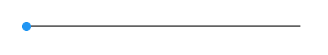
somebox:add(rtk.Slider())
Sliders can be made discrete via the step attribute, and tick marks can be enabled
using the ticks attribute:
somebox:add(rtk.Slider{step=10, ticks=true})

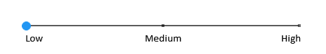
Ticks positions can also be labeled:
somebox:add(rtk.Slider{step=1, ticks=true, min=1, max=3, ticklabels={'Low', 'Medium', 'High'}})
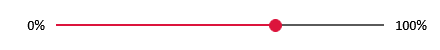
If you want labels on either end of the slider, it's easy enough to place it in an
rtk.HBox with rtk.Text instances for labels. This example also shows that the
slider color can be changed, and its value initialized:
local hbox = somebox:add(rtk.HBox{spacing=5, valign='center'})
hbox:add(rtk.Text{'0%'})
hbox:add(rtk.Slider{color='crimson', value=67})
hbox:add(rtk.Text{'100%'})
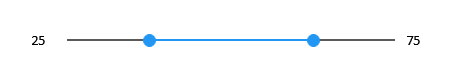
Sliders may contain arbitrarily many thumbs, by passing a table of values as the value
attribute, rather than a scalar. This is commonly used to implement range sliders. Here's
a more complete example showing a range slider with labels on either end, all packed into
an rtk.HBox, and updating the labels based on current slider values. Note here we must
use a fixed-width rtk.Text to ensure the slider size doesn't shift around as the value
changes:
local hbox = somebox:add(rtk.HBox{spacing=5, valign='center'})
local min = hbox:add(rtk.Text{'25', w=25})
local slider = hbox:add(rtk.Slider{value={25, 75}, step=1})
local max = hbox:add(rtk.Text{'75', w=25})
slider.onchange = function(self)
    min:attr('text', self.value[1])
    max:attr('text', self.value[2])
end
Unlike most widgets whose intrinsic size is based on some aspect of
of their attributes (for example, the intrinsic size of an rtk.Text widget is based
on the rendered size of its text attribute), sliders are naturally
greedy and will consume the full size of the box offered by their parents. So a
horizontal slider will consume all remaining width available within its parent
container. In other words, it always behaves as if the fillw
cell attribute has been set to true.
If you want to constrain this greediness, you can use the maxw attribute to
limit the upper bound of the slider's width. Of course you also specify a
fixed width using the w attribute, but maxw is usually the better choice as
it allows the slider to shrink according to its parent. And if you want to ensure
it can't shrink too much, you can use minw.
Used with the ticks attribute, where lowercase versions of these constants without
the TICKS_ prefix can be used for convenience.
| rtk.Slider.TICKS_NEVER¶ | 'never' |
Never display tick marks |
| rtk.Slider.TICKS_ALWAYS¶ | 'always' |
Always display tick marks (requires |
| rtk.Slider.TICKS_WHEN_ACTIVE¶ | 'when-active' |
Only display tick marks when the user is actively moving a slider thumb by mouse
(requires |
| value | number or table | read/write |
The current value of the slider, between |
| color | colortype or nil | read/write |
Overall slider color, affecting the thumb (unless overridden by |
| trackcolor | colortype or nil | read/write |
Track color along which the thumbs are dragged, which uses the theme's
|
| thumbsize | number | read/write |
The radius of the circular slider thumb (default 6) |
| thumbcolor | colortype or nil | read/write |
The color of thumb handles, which defaults to |
| ticklabels | table | read/write |
When |
| ticklabelcolor | colortype or nil | read/write |
The color of the labels written next to ticks when |
| spacing | number | read/write |
The amount of additional space between ticks and |
| ticks | tickconst or bool | read/write |
Controls whether and how ticks should be displayed when |
| ticksize | number | read/write |
The size of the square tick marks when |
| tracksize | number | read/write |
The size of the slider track (default 2) |
| min | number | read/write |
The minimum allowed value of any thumb in the slider (default 0) |
| max | number | read/write |
The minimum allowed value of any thumb in the slider (default 100) |
| step | number or nil | read/write |
Snaps slider thumb values to discrete step boundaries (default nil) |
| font | string or nil | read/write |
The name of the font face (e.g. |
| fontsize | number or nil | read/write |
The pixel size of the slider font (e.g. 18) for all labels, which uses the global slider font size by default |
| fontscale | number | read/write |
Scales all font sizes by the given multiplier (default 1.0) |
| fontflags | number or nil | read/write |
A bitmap of font flags to alter the label appearance (default nil) |
The current value of the slider, between min and max (default 0).
Multiple slider thumbs can be created by setting this value to a table of values, rather than a single scalar value. Arbitrarily many thumb values may be specified here, but a common use case is to specify two thumbs to implement a range slider.
This attribute may be passed as the first positional argument during initialization. (In
other words, rtk.Slider{42} is equivalent to rtk.Slider{value=42}.)
The calculated version of this attribute is always a table, even when you pass a scalar value.
Overall slider color, affecting the thumb (unless overridden by thumbcolor) plus
the active portion drawn over the track, which uses the theme's
slider value by default.
Track color along which the thumbs are dragged, which uses the theme's
slider_track value by default.
The radius of the circular slider thumb (default 6).
The color of thumb handles, which defaults to color.
When step is defined, this is an optional table of strings to be displayed next
to each tick mark (default nil). The labels provided are mapped in index order.
ticks may be disabled -- labels will still be drawn at the tick positions -- but
this attribute is ignored if step is nil.
The color of the labels written next to ticks when ticklabels is defined, which
defaults to the theme's slider_tick_label value.
The amount of additional space between ticks and ticklabels (default 2).
Controls whether and how ticks should be displayed when step is defined (default
TICKS_NEVER).
For convenience, a boolean value can also be provided, where false is TICKS_NEVER and true is TICKS_ALWAYS.
The size of the square tick marks when ticks is enabled (default 4).
The size of the slider track (default 2).
The minimum allowed value of any thumb in the slider (default 0). Thumb values will be clamped to this minimum value.
The minimum allowed value of any thumb in the slider (default 100). Thumb values will be clamped to this minimum value.
Snaps slider thumb values to discrete step boundaries (default nil). When disabled (nil), the thumb values are continuous.
The name of the font face (e.g. 'Calibri') for all labels, which uses the
global slider font by default.
The pixel size of the slider font (e.g. 18) for all labels, which uses the global slider font size by default.
Scales all font sizes by the given multiplier (default 1.0). This is a convenient way to adjust the relative font size without specifying the exact size.
A bitmap of font flags to alter the label appearance (default nil). Nil (or 0) does not style the font.
See also handlers for rtk.Widget.


