rtk.Box
Boxes lay out widgets sequentially in one direction (either horizontally or vertically).
This is the base class for single-direction box layouts. Don't use this class
directly -- use rtk.HBox or rtk.VBox instead. However, in order to avoid
documenting everything twice, the interface for both box orientations is documented
here.
When describing the behaviors, phrases like "box orientation" or "box direction" refers to the dimension children are laid out within the box. For VBox the box direction refers to either vertical or height (depending on the context), and for HBox it refers to either horizontal or width.
For example, if we say "fills the cell in the box direction" it means the fill is horizontal for HBox, and vertical for VBox.
While boxes support all the cell attributes documented in rtk.Container, the most
important box-specific cell attribute is expand. The expand cell attribute
controls how much space is allocated to a cell in the box direction.
When expand isn't specified (or when it's explicitly 0) the cell will be only as
big as necessary to fit its widget, but expanded cells will force the overall box to
fill out to its own bounding box (in the box direction) and then will compete with one
another for that available space.
This mechanism can be used to create fluid layouts. For example, an rtk.HBox added
directly to an rtk.Window can create a multi-paned layout that scales with the
window. Consider:
local box = window:add(rtk.HBox())
-- Creates a 3-column layout.  fillh=true is needed for this simple example to ensure
-- the Spacer widgets fill the height of the box.  (stretch='full' would also work for
-- this demonstration, although it is subtly different.)
box:add(rtk.Spacer(), {expand=1, fillh=true, bg='cornflowerblue'})
box:add(rtk.Spacer(), {expand=1, fillh=true, bg='royalblue'})
box:add(rtk.Spacer(), {expand=2, fillh=true, bg='tan'})
This code generates a box that looks and scales like this:

While widgets can specify fractional values for w and h which are relative to the
bounding box imposed by the parent, use of fractional geometry for widgets can yield
some surprising behavior in boxes: the available space for a given widget (and
therefore the bounding box against which fractional values are calculated) shrinks with
each subsequent widget in the box.
So for the first widget in an rtk.HBox, w=0.5 will mean 50% of the overall box,
because it's offered all available space. Then, having taken up half the offered
space, the remaining half will be offered to the second widget in the box. If that
second widget also specifies w=0.5 then it's actually half the remaining space,
which works out to 25% of the overall box.
For this reason, it's preferred to use expand for responsive layouts, which behaves
more intuitively.
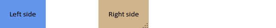
rtk.Box.FLEXSPACE can be added to boxes in place of a widget to push any subsequent
widgets all the way out to the far edge of the box. Flexspaces consume all
remaining space not used by widgets. This is similar to adding an rtk.Spacer with
expand=1, except that flexspaces do not create cells, they only modify the positions
of cells after the flexspace. Flexspaces are therefore a tiny bit faster, and a tiny
bit more convenient and readable.
For example:
local box = window:add(rtk.HBox())
box:add(rtk.Text{'Left side', padding=20}, {bg='cornflowerblue'})
box:add(rtk.Box.FLEXSPACE)
box:add(rtk.Text{'Right side', padding=20}, {bg='tan'})
This produces:
If multiple flexspaces are added to a box, the unused space will be divided between them
(as if they had all used the same expand value).
Note that as flexspaces don't technically create cells, any cell attributes passed to
add() are ignored. This means, for example, bg can't be defined
on flexspaces, because there's no cell to color. If you do need this, explicitly add
an rtk.Spacer widget with expand instead.
Used with the stretch cell attribute to control cell size perpendicular to the
box direction, where lowercase strings of these constants can be used for
convenience (e.g. 'siblings' instead of rtk.Box.STRETCH_TO_SIBLINGS).
These strings are automatically converted to the appropriate numeric
constants.
Cell attributes are passed to e.g. add() and control how a child is laid out within its cell.
In addition to these box-specific cell attributes described below, boxes also support all the cell attributes from the base rtk.Container. However in some cases the possible values are extended, so those deltas are documented below.
| expand | number or nil | Dictates allocated cell size in the box direction and only in that direction (default nil) |
| fillw | boolean | Controls how the child will fill its width within the cell (default false) |
| fillh | boolean | Controls how the child will fill its height within the cell (default false) |
| stretch | stretchconst, boolean or string | Whether the cell should expand perpendicular to the box direction, unlike the
|
Dictates allocated cell size in the box direction and only in that direction (default nil).
If not defined (or expand is 0), which is default, then the cell will
"shrinkwrap" to the child's intrinsic size in the box direction. By setting
expand to a value greater than 0, the cell will be sized according its ratio of
expand units relative to all other expanded siblings, minus any space needed for
non-expanded children.
For example, if only one child in the box has expand=1 then space for all
other cells will first be reserved to fit their (non-expanded) children's intrinsic
size, and then all remaining space in the container will be given to the expanded
cell.
Or suppose you have 3 children in the box and all of them are given expand=1,
then the total expand units is 3, and each child will be given 1/3 of the container
space.
Or if you have 2 children, one with expand=1 and the second with expand=2, then
the total expand units is again 3, and the first child is given 1/3 of the box
while the second is given 2/3. Fractional values work too: for example, one child
with expand=0.2 and another with expand=0.8. (The expand units are arbitrary
and don't need to add up to 1 -- only the child's ratio against the total expand
units matters -- but if using fractional values you may find it less confusing to
have them sum to 1.0.)
Note that expand only controls the cell size in the box direction. The child
will not automatically fill to fit the cell; for that use either fillw or fillh
(depending on the box direction). Non-filled children however may be aligned
within an expanded cell by using either the halign or valign cell attributes
(whichever corresponds to the box direction).
This image demonstrates expand with rtk.HBox, with the blue color indicating
the background of the expanded cells. (rtk.VBox works the same except of course
that the expansion is in the vertical direction.)

When adding a box to an rtk.Viewport which is flexible in the box direction
(i.e. adding an rtk.HBox to a viewport with flexw=true, or
adding an rtk.VBox to a viewport with flexh=true), if the
box itself has no explicit size of its own in the box direction then expand=1
would technically be infinite.
In practice obviously an infinite size isn't possible, so instead the box calculates expanded cell sizes as if the viewport wasn't flexible, and instead uses the viewport's own bounding box as the needed constraint. But this behavior is subject to change in future, so it's recommended not to rely on it.
Controls how the child will fill its width within the cell (default false). If true, the child widget will fill the full width of the cell. Otherwise, if false, it will use its natural width.
For rtk.HBox, setting fillw=true implies expand=1 if expand is not already
defined. Meanwhile, for rtk.VBox, setting fillw=true implies stretch=true.

Controls how the child will fill its height within the cell (default false).
Everything described about fillw applies here, except with the orientation
swapped. So for rtk.VBox, setting fillh=true implies expand=1 (if expand
isn't already defined), and for rtk.HBox setting fillh=true implies stretch=true.
Whether the cell should expand perpendicular to the box direction, unlike the
expand attribute which is in the box direction (default false).
This diagram depicts the difference between expand and stretch for the different
box types:
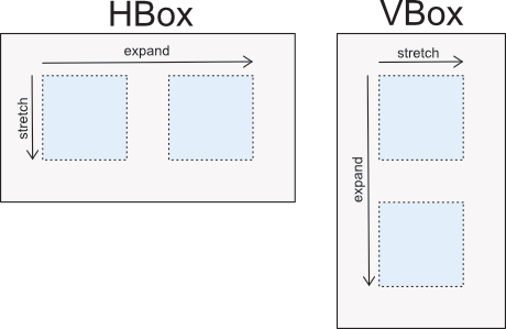
Unlike expand, the stretch value is not expressed in units because there's no
competition for space between siblings. Instead, the stretch
constants apply here. However, for convenience, a boolean can also be used for
the most common cases, where true is equivalent to STRETCH_FULL and false is
equivalent to STRETCH_NONE.
Like expand, stretch dictates the cell size, not whether the widget should
itself fill out to the cell's edge. For this, fillw or fillh (whichever is
opposite of the box direction) is still required.
Stretching can be useful for alignment purpose. For example, if you have an
rtk.HBox and set the cell attribute valign='center' the question is what should
the widget be centered vertically against? Unless stretch is explicitly set to
STRETCH_FULL, the implied value is STRETCH_TO_SIBLINGS, so that the widget
will be centered relative to its tallest sibling. If stretch meanwhile is
STRETCH_FULL, a valign='center' widget in the rtk.HBox will be vertically
centered relative to the box's own parent-imposed height limit.
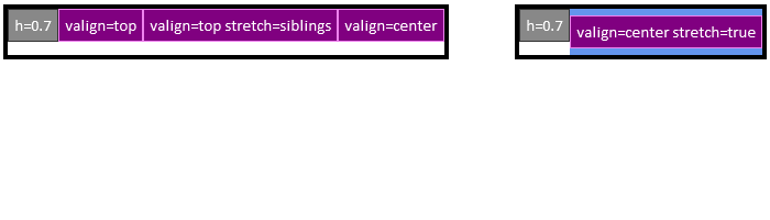
Here are two examples showing the behavior of stretch in the context of two HBoxes,
where stretch applies in the vertical (i.e. perpendicular) direction. The thick
black rectangle is the boundary of the HBox. In the left example, the
center-valigned purple sibling is centered relative to the grey h=0.7 widget
because stretch=siblings is implied due to non-top alignment. In the right
example where stretch is true, now the purple widget is centered relative to the
HBox's full height.